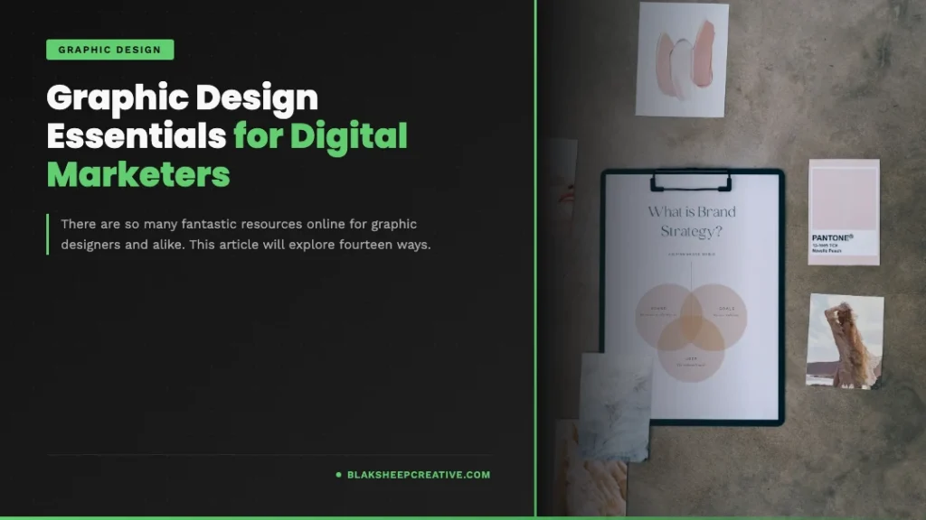
There are so many fantastic resources online for graphic designers. This article will explore fourteen ways digital marketers and DIY graphic designers can use these resources to stay on top of the latest design trends and incorporate them into their marketing campaigns.
Without further adieu, here is our list of things you should know when creating visual elements for advertising and marketing purposes.
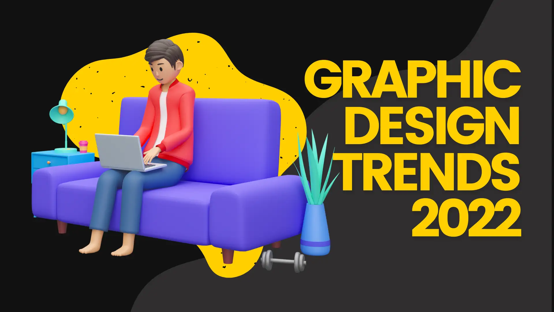
Graphic Design Trends & Digital Marketing
Every year, new trends in design trickle down to more mainstream websites. As times change, so do consumers’ preferences and ways of using websites, online assets, and print assets (yes, people still use traditional advertising).
That is why digital marketers need to stay up-to-date with the latest graphic design trends, mainly how they can be used appropriately to their advantage.
Digital marketing trends change.
Graphic design has to follow those trends and adapt to them.
Overwhelming amounts of content can be challenging to read. When placing text over an image, it’s important not to crowd the text; balance needs to be achieved between color, shape, and text.
Make your image genuinely stand out!
Creating visual content that accurately reflects digital marketing trends is crucial.
Today’s digital marketing world is more competitive than ever. Success is often measured in the amount of traffic a website receives, how well it converts visitors into customers or email subscribers, and if an online asset drives brand awareness.
Most importantly, designers need to create design assets that are visually appealing to their audience. Without this basic understanding of design principles, even the most talented digital
Here are a few popular trends that graphic designers (both professional and DIY) should be aware of:
The image above is an example of flat graphic design.
Flat Graphic Design
With the rise of smartphones, tablets, and touch-based desks, UI designers have been leaning towards a more flat design to create a user interface that is easy to navigate with a finger.
Many digital marketers may think that this graphic design trend is solely for UX designers creating mobile apps or websites that direct consumers to specific functions like buying an item, reserving a room in a hotel, etc.
However, flat graphic design isn’t just about the contrast between backgrounds and text, but about using the right colors, font types, and even white space to create an aesthetically pleasing website.
Just because digital marketers don’t have to create apps for specific functions does not mean this flat design trend should be ignored. Many digital marketers are realizing that they can benefit from this trend because it creates a clean look without being too distracting.
For example, let’s discuss the Apple logo.
The Original Apple Logo (Circa 1976)
The Rainbow Apple Logo (1976 – 1998)
The Monochrome Apple Logo Design (1998 – 2000)
As the above examples show, the Apple logo has included various degrees of flat design, which is why it remains popular and identifiable today.
But, while its logo may have changed, its brand message has remained the same.
Digital Marketers should take note that the Apple logo became popular during the digital revolution in which computers moved from being tools used primarily by businesses to becoming an integral part of everyday life for consumers.
Before its September 1, 2014 update, the logo was a bit crowded and featured many textures and gradients.
On the other hand, after the redesign, the logo is flat and clean, but it also utilizes multiple bright colors to reflect its brand while using white space to highlight key aspects of its logos, such as the bite mark.
This is just one example of how digital marketers can use this flat design trend to create an aesthetically pleasing website that reflects their brand without being too distracting.
If you’d like to learn more about the Apple logo’s evolution over the years, check out this article at creativebloq.com.
More minimalism and flat design
Minimalism in graphic design has been on the rise for a few years now, and it doesn’t seem to be going away any time soon. This is particularly evident in the trend towards flat design. Designers are stripping down their designs to simple shapes, colors, and typography.
While this may not be suited for every type of digital marketing campaign, it can be a great way to simplify your design and focus on the most important elements.
Flat design is often described as being “authentically digital” because it’s clean, simple, and modern, just like many of today’s digital consumers.
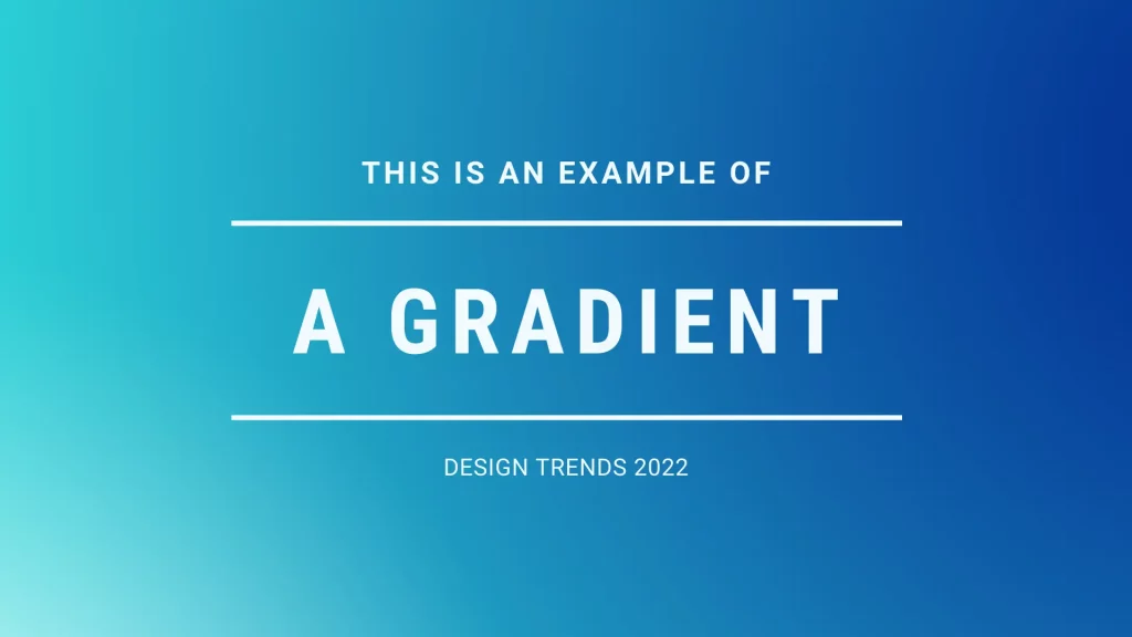
Gradients, patterns, and textures
Gradients, patterns, and textures are popular graphic design trends that create an exciting and unique look for your digital marketing campaigns.
Gradients are a great way to add some color and interest to your design, and they can be used in a variety of different ways. You can use them to create a background for your website or as an accent color for your text or buttons.
Patterns can also be used to add visual interest to your website. You can find various patterns online that you can use in your designs.
Textures are a bit more subtle than gradients or patterns, but they can add some texture and depth to your design.
These design trends can be used to create an aesthetically pleasing website. Many digital marketers realize that they can benefit from these graphic design trends when making their own websites.
However, remember that gradients, patterns, and textures should not be the main focus of your design; you should never overshadow important content with too much visual flair.
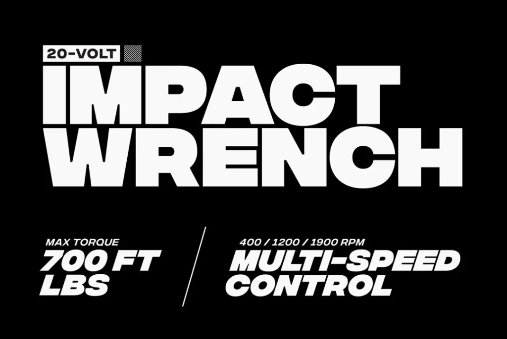
Stronger bolder typography
Typography is an essential part of every design because it gets your message across.
In the content.
Typography is one of the most critical design elements you need to pay attention to when designing your website. If your content’s topography isn’t legible or doesn’t match your brand’s style, then there’s a good chance that nobody will want to read it.
You can use typography to create a certain mood or feeling, and you must pay attention to choosing the right font for your brand.
Remember, graphic design is all about effective communication. If you’re not able to communicate effectively with your audience, then what is the point of using graphic design?
You can get inspiration for more legible typography by checking out this article on 99designs. You’ll find some great examples of typography and some tips on making your content more readable.
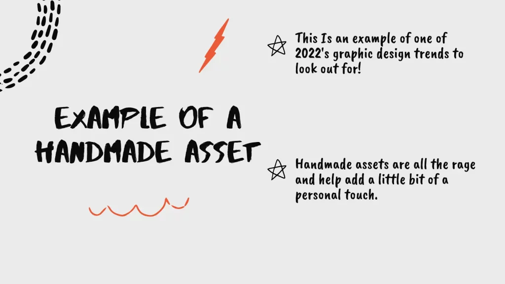
“Hand-made” looking assets
One trend in digital marketing that’s becoming increasingly popular is using “hand-made” looking assets. This means that designers are trying to create a more organic and natural look. It can be seen in everything from website design to social media graphics.
There are a few reasons why this trend is becoming so popular.
First, people are becoming more and more interested in natural and organic designs.
Second, hand-made looking assets can be used to create a warmer and more personal feeling for brands.
And finally, this trend is popular because it can be used to stand out from the competition.
High-quality images
It’s almost cliche, but a picture is worth a thousand words.
Today’s digital consumers are visual creatures, and they like to see high-quality images that display the product or service they’re interested in purchasing.
When it comes to digital marketing, high-quality images and fonts are essential. Not only do they help your designs stand out from the competition, but they also help create a more professional and polished look for your brand.
Stock Photos
If possible, avoid using stock photos. Instead, try to use images that are relevant to your brand. For example, if you sell sunglasses, take a picture of your existing customers or employees wearing your sunglasses and use that for your photo.
After all, people want to see photos of your high-quality products. That’s what you’re selling, right?
If you deliver high-quality products, then dull and boring stock images aren’t going to convince anyone that your product is high-quality.
This doesn’t mean you need to hire a professional photographer. Smartphone cameras are more than capable of taking some great photos that can compete with stock images.
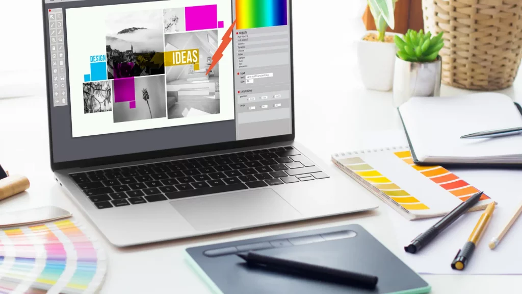
Vector Graphics
Another thing to consider is using vector-based images or graphics. Vector-based images, such as those created with Illustrator on Adobe, are scalable and editable. This means that you can use the same image across multiple platforms without losing quality or resizing it.
Create a style guide for your brand
When creating a style guide for your brand, think about what you want your customers to feel when they see your designs. Do you want them to feel excited Professional Engaged?
Once you have an idea of the feeling you want your customers to experience, start thinking about the specific elements to help you create that feeling.
Compelling graphics help you achieve specific objectives.
Graphic design plays a massive role in your content marketing strategy. If you’re able to incorporate these modern graphic design trends into your next campaign, then not only will your designs stand out from the competition, but they’ll also create a more polished and professional look for your brand.
It’s all about the feelings!
For example, suppose you want your customers to feel excited. In that case, you might use bright colors and playful fonts in your designs (more on colors later). If you want them to feel professional, you might use more muted colors and traditional fonts.
Once you have a general idea of the elements you want to use in your designs, start creating a style guide. This can be as simple as a document with links to the logos, fonts, color swatches, and other elements you typically use in your designs.
Remember, your graphic designs should align with your brand’s principles.
Create a mood board for your brand
Another way to introduce consistency into your designs is to create a mood board. This is typically an image or series of images that give you an idea of the overall feel you want people to experience when they encounter your brand.
For example, if you want people to feel engaged when they see your designs, you might have a mood board full of photos from sporting events or parties. If you wanted to create a more laid-back mood board, it might include beach landscapes or images from a summer clothing collection.
Mood boards can be especially effective when paired with typography. For example, if you want to convey excitement, you could use loud colors and playful fonts. Muted colors and traditional fonts might be more appropriate to convey professionalism.
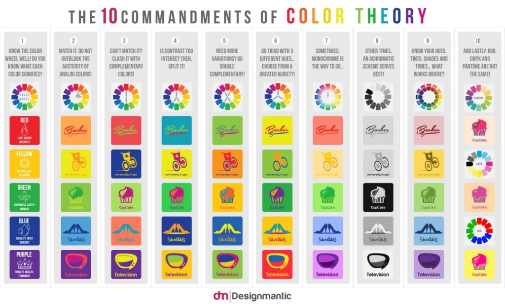
Image Source: designmantic.com
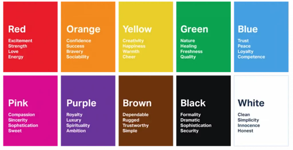
Good Graphic Designers Use Color Theory
Colors can make something look different. For example, if you want people to feel excited, you might use bright colors and playful fonts in your graphic designs(more on colors later). If you want them to feel professional, you might use more muted colors and traditional fonts.
Understanding color is essential for designers because they need to know which design techniques will work best with their desired effect.
Color plays a significant role in your customer’s decision-making process.
There are three different types of color- monochrome (one color), complementary (two opposite colors), and split complementary (two adjacent colors).
The three types of color are used in the design process in different ways:
- monochrome might be used as a background or typeface
- complimentary could be used for branding
- split complementary could be used for a button or other interactive design element.
When you’re working with the three different types of colors, it’s important to remember that one color is always dominant- monochrome, complementary, or split complementary.
To decide which color should dominate your designs, ask yourself what emotion you want to covey and choose accordingly. If you’re going to convey excitement, bright colors work best. If you want to convey professionalism, more muted colors are better.
Once you have a general idea of the emotions you want to convey through your designs, start thinking about how specific colors might affect those emotions. Speaking of emotions, be sure to read our recent blog post on emotional marketing and how you can use it to generate results.
For example, if you want people to feel excited when seeing your design, choose colors associated with excitement. Choose color palettes that convey relaxation if you want them to feel relaxed (more on color associations later).
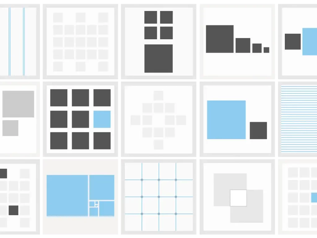
Experiment with different page layout techniques.
When you’re working with a client, it’s tempting to jump right into the design process. After all, you want your client to be impressed with your first design, and this is often the best way to ensure that happens.
But taking a more systematic approach can increase the quality of your designs and help you understand what will work best for your audience.
Two good ways to experiment with different page layouts are by using a grid or considering your user’s needs or preferences.
A grid is essentially just a set number of columns that organize content into chunks. The size of each column usually depends on the width of the screen you’re designing for, but it doesn’t have to be limited to that.
For example, you might choose to break up content into three or four columns if the screen is big enough. Or, you might select six columns if the screen is small.
User preferences and needs also influence page layouts. For example, people often prefer simple designs that use serif fonts for body text. They also tend to like content that is broken up into chunks.
This might seem counterintuitive, but people prefer shorter paragraphs and want to be able to scan through information on a page quickly.
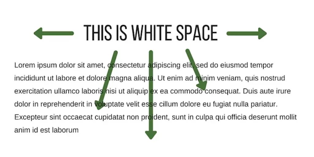
When applying visual hierarchy, use white space to emphasize key elements.
White space is the empty space on a page or around text, images, or other design elements. It’s essential to good design because it allows people to focus on what’s important and avoid distractions.
White space plays an essential role in setting your key element(s) apart!
Use white space to emphasize certain content.
In the digital marketing industry, white space is often used to draw attention to important content on a page. This allows people to scan through the page quickly while still giving them the information they need.
It also makes it easier for people to read text. So, if you want your customers to read an article or other piece of text easily, don’t overcrowd it with images or other design elements.
Use white space to show visual hierarchy.
You can use white space to distinguish between different levels of hierarchy. For example, if you want the most critical element on your page to stand out, you might give it more white space around it compared to less important elements.
Understand your audience
Before you design something, it’s essential to understand who your audience is. This way, the designs and messaging will be more effective (and you’ll save a ton of time).
If you don’t know who your audience is or what they like, take some time to do research. Search for hashtags on Instagram and Facebook; follow bloggers and online personalities; see what’s trending on social media, but please don’t hijack other brand’s hashtags..
Whatever you do, try to stick with the most popular posts and most popular accounts. This is where your audience might be hanging out, not in the small groups or unpopular posts that aren’t as easily searchable.
Once you find some social media pages and influencers who resonate with your target audience, analyze their content and branding.
What type of designs do they use?
How do they interact with their audiences?
Do you resonate with them as well?
If so, this might be an excellent place to start when you’re designing your own graphics or marketing materials.

Create graphics that effectively tell your brand’s story
You have a story to tell no matter what business you’re in. And as a graphic designer, it’s your job to help tell that story through your visuals.
Content marketing is one of the most popular ways brands can tell their stories. But there are some essential things to keep in mind when creating content for your desired audience.
Don’t get too technical. You don’t need to have a degree in marketing or know all about SEO (that’s what your content manager is for). Simply create the best brand story you can
Your digital assets- such as your website, social media pages, and marketing materials- should all align with your story. This way, your branding will be more cohesive, and your audience will better understand what you’re all about.
If you work for a larger company, create and adhere to your corporate branding guideline. This will ensure that your graphics, logos, and colors align under one brand.
Plus, a good story instills brand recall in your audience. This means that when they see specific colors, images, or logos, they’ll be able to associate them with your brand!
Brand Recall
Brand recall is the ability of a customer to remember a brand’s name and logo. This is an important factor in marketing because it can help customers remember your company and what it represents.
Brand identity is the way customers see a brand. It’s the combination of visuals, messaging, and feelings that customers associate with a brand.
This helps customers understand what a brand represents and whether they’re interested in doing business with it.
Brand recall and brand identity are essential for potential customers because they help them learn about your company and decide whether they want to do business with you.
But they’re also important for current customers because they help remind them why they do business with you.
Brand recall and identity can be strengthened through marketing materials such as social media pages, graphics, and logos.
Graphic designing + brand recall = no brainer.
Create graphics that fit seamlessly into your target audience’s lives
Now that you’ve got a good idea of your target audience and the emotions you want them to feel when they look at your designs, it’s time to think about where they might see those graphics.
If you’re creating graphics for social media, it’s helpful to think about the feeds and timelines of your audience.
What type of content do they like to interact with?
Do they like funny photos or profound quotes that make them stop scrolling long enough to read it?
Ask yourself these types of questions before designing any graphics so you can align what you create with your audience’s preferences.
As mentioned earlier, it’s vital to create seamless content and digital marketing solutions for your target audience. This means that you should also think about where else they might see your designs.
Will they be in the online world only?
Will they be on a business card?
Will they be on a billboard?
On posters?
Mobile devices?
At events?
It might be helpful to create mockups of these types of scenarios so you can see how your designs will look in the real world.
Different mediums can communicate messages differently, so it’s important to create graphics that work best on each platform.
For example- if you use lots of bright colors and colorful images for your social media pages, it might be too distracting if you try to use the same design style in print. A lack of color could make specific details or messages more difficult to read.
However, if you’re creating a logo for your website and social media pages, but not for anything else, you’ll probably want to use more color and playful images. This will make your brand stand out as fun and exciting!
The key is thinking about how each design style works best for the different platforms you use to communicate with your target audience.
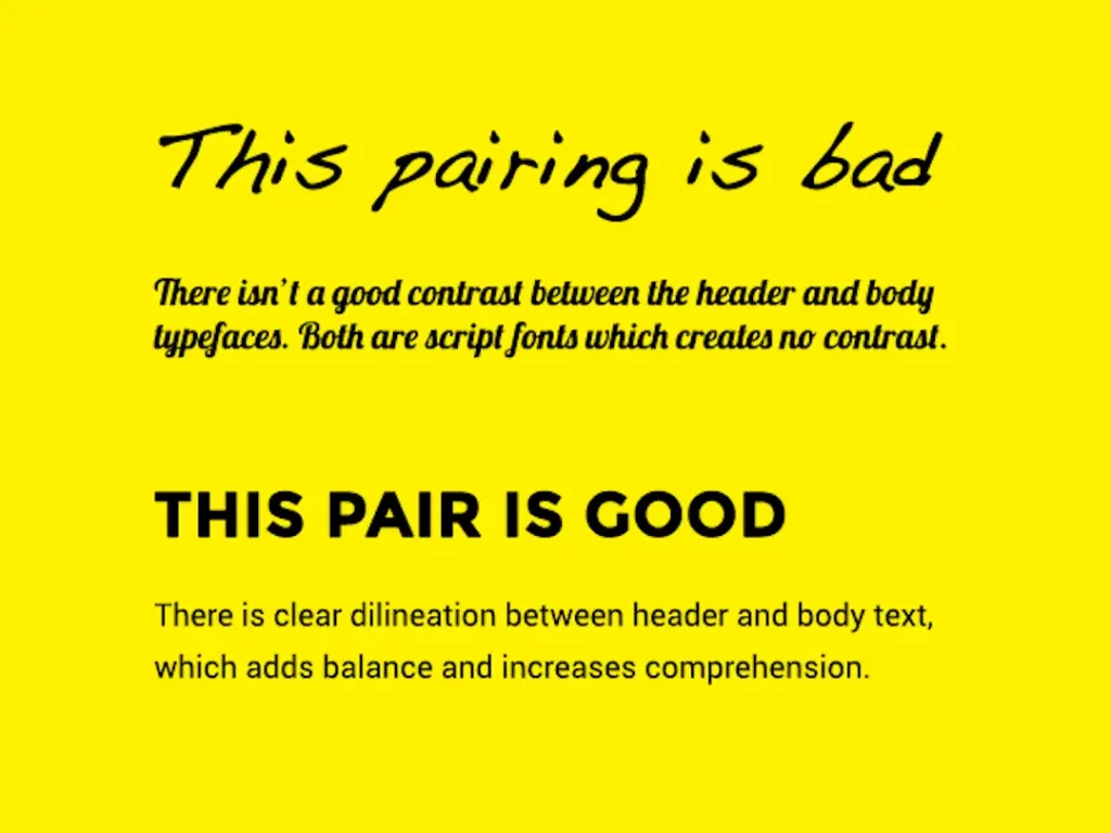
Combine color with font choice
If you haven’t figured out what emotions you’re trying to convey through your visual content, now is the time to do so.
Visual communication is one of the most effective ways to affect and change how your target audience feels. Hence, you want to think about what type of emotions they experience when looking at different colors and font styles.
The graphic designing process is a lot like storytelling. And in any good story, the letters and words are critical components to telling your brand’s story. The same is valid for design- without font choice, your designs won’t communicate nearly as much as they could.
Of course, choosing the right font isn’t easy at first glance. To make it easier on you, start by figuring out what emotions you’re trying to convey through your graphics. Then, think about font choices that might help support these emotions.
If you want to convey excitement, comic sans might not be the best option (unless that’s what you’re going for). You can use a Google Fonts search to find different fonts and experiment with how they’d work in your designs.
When choosing fonts for your projects, make sure to check out the user license. Different fonts come with different requirements. Many Google Fonts are free and open-source, while others might require attribution or ask you to sign up for an account (in which case it’s a good idea to do so). Other fonts can be purchased, which is fine if you have the budget.
But most importantly, your font choice should be guided by what your audience will understand best. Remember that your graphic design process isn’t just about you- it’s about who you’re designing for!
Your target audience might not know how to read a particular type of calligraphy or old English print. In that case, you might need to choose a simpler font that’s more accessible for your audience.
Remember, humans are visual creatures. And any good graphic designer will tell you: it’s your job to create visuals that capture and communicate emotion.
Once you find the typeface you want to use for your graphic, make sure it is legible and not too busy. Remember, a huge goal of good design is simplicity- don’t clutter up your quality designs with complex fonts or many colors.
If your designs are monochrome, choose one color that will be dominant throughout the graphic. Whatever color you choose should be appropriate for your brand- if you want people to feel professional, go with a more conservative color like black or white.
If you want to make them feel excited or happy, choose brighter or more vibrant colors.
If your graphics are split complementary, pick one color for the focal point and another color (the accent) to highlight it. If you’re using two complementary colors, try using the same tones but different intensities.
Blue is an excellent example of this- you can use darker tones of blue for the focal point and light tones of blue for the accent.
If you want to make them feel excited or happy, choose brighter or more vibrant colors.
If your graphics are triadic, choose three primary colors that are bright but not too contrasting. This is another color scheme that you can use to create a cohesive look and feel.
If you want to make them feel excited or happy, choose brighter or more vivid colors.
If your graphics are split complementary, think about the focal point as if it were the sun and the other colors as rays of light around it.
Choose two colors for those rays (often the colors on each side of your accent color) and then select a color for the area around the focal point. The last color should be the one that ties everything together.
If you want to make them feel relaxed or tranquil, use softer colors or pastels.
If your design is monochrome, think about what emotions are often associated with black and white. If you want people to feel elegant, use black, white, and gray variations. You can also use different tones of one or two colors if your page is primarily monochrome.
If you want to make them feel elegant or classy, choose more muted tones appropriate for your brand.
Here’s a little graphic designing secret: People are often drawn to images that have pops of bright color. Images with red accents might grab people’s attention more quickly than other colors.
Brand recall is a massive part of digital marketing and graphic design. People must be able to instantly recognize your brand’s logo, colors, and fonts the instant they see it. Color theory is a great way to get them there- try using color accents or patterns that people will notice right away.
Create graphics with universal visual appeal
No matter what your business is, you want people to feel like they can relate to your brand. You want them to understand the emotions you’re trying to convey.
Remember, what you design speaks volumes about your business. Be sure you choose the right words and images to give people a positive perception of your brand.
For that reason, you should choose fonts and imagery that are easy for audiences from all demographics to understand.
Avoid fonts that are too fancy or stylized, as they might be difficult for audiences to read.
Whenever possible, choose sans serif fonts (those with no embellishments like curlicues), which are easy to read even when used at small sizes on digital devices.
Choose sans serif fonts if you want your designs to feel modern and sleek.
Choose realistic and clear images; they should be appropriate for the audience you’re trying to reach. Avoid overly stylized or abstract graphics that could leave your audience confused. It’s good practice to check out what kinds of imagery are trending with other brands in your industry- you might find a new artist or style that inspires your designs.
Choose simple images if you want your designs to be modern and sleek. Make sure the imagery reflects your target audience.
Remember, the point of graphic design is not just to look good. It’s to help you achieve your marketing goals! You’ll have a much easier time reaching your audience if they can understand and connect with what you’re trying to portray- whether that’s words, images, or colors.
Keep designs simple and clean.
It has been said that a designer’s true success lies in their ability to convey information and emotion effectively. For this reason, having designs that are too complex only makes the task of getting your message across more difficult for potential clients. Even if your designs are exceptional, they will still be challenging to understand if they are overcrowded. This is why you must keep things clean and simple.
Use space wisely
How you use negative space can profoundly affect how users feel when looking at your design. Negative spaces serve many different functions for designers. They can help lead the eyes to important information, create a focal point, and make designs feel more minimalist. These factors play into whether or not users experience your design as clean and accessible.
If you want to make graphics that will engage your audience, use negative space to guide their eyes towards important details.
The first step is to identify what you want the user to see first and then put the item in a distinct area with plenty of negative space around it. You can combine this technique with the concept of white space by ensuring there is enough room between ideas for users to process them individually.
If you want your designs to be clean and organized, make sure they follow the concept of white space.
Make sure that users can process information in digestible chunks by providing plenty of negative space between objects. If there is too little or no negative space around one thing, it can clutter a design and make the message difficult to understand.
Avoid using too much negative space in your graphics since it can clutter up designs and make them harder to read.
Design for different platforms
As the technology behind devices continues to evolve, you should remember that your graphics might need to be designed differently depending on the platform. This is especially important for social media because different networks have different requirements.
Remember that the dimensions might differ depending on the network, so you want to be prepared to make several versions of one particular image so that you can accommodate the varying resolutions, dimensions, and file types.
Test, test, test!
Marketing professionals will tell you that it’s all about the data.
You can’t always rely on your intuition- you need to change your campaigns based on what works and doesn’t work for your audience. While that means a lot of testing, it also allows a lot of information gathering. Use data to determine which colors and tones will be most successful in drawing in audiences or inspiring them.
Data is the best way to understand what colors, fonts, and imagery will work best for your business.
Graphic designing is not science. What may work for one audience might not work for another. For this reason, it’s of crucial importance to test and experiment with your designs so you can adjust them accordingly.

Get feedback from others.
It’s also a good idea to get feedback from others before you publish your work. By showing your designs to people who aren’t familiar with them, you can get a sense of how easy they are to understand. Be prepared to make changes based on the feedback you receive- after all, the goal is to have graphics that are both effective and appealing to your audience.
You can get a sense of how easy your graphics are to understand by showing them to people who aren’t familiar with the topic.
A small final note: For all designs to be effective, they have to be relatable to your specific audience. The techniques mentioned here might seem general, but that’s because they apply across the board.
Take the time to get to know your audience, and you can’t go wrong.
Graphic design is a critical component of any digital marketer’s toolkit. By understanding the basics of good graphic design, you can create compelling and appealing visuals for your audience.
We’ve highlighted some essential tips for using negative space, white space, and testing your designs in this article.
We also suggest getting feedback from others before publishing your work. Follow these guidelines, and you’re sure to churn out graphics that will engage your audience and help promote your brand or product.
You want your graphics to be clean and organized, but you don’t know how to start.
Most people never learn graphic design basics, so their designs look cluttered and unprofessional.
BlakSheep Creative can save you time and money by letting our expert graphic designers create beautiful, effective designs for your brand or business. We’re Denham Springs, LA’s leading branding agency.
We create graphics to take your company’s ideas and communicate them to your audiences. Boost sales and build your online presence by contacting us today!
If you’re interested in seeing how we can help meet your graphic design needs, give us a call at (225) 505-3834 or email info@blaksheepcreative.com today!
Digital Marketing Services
BlakSheep Creative is an award-winning digital marketing agency that offers various services to help you improve your online presence.
We offer creative graphic design, affordable web design, SEO Services, content creation services, social media management services, and more!
Contact us today by calling (225) 505-3834 or emailing info@blaksheepcreative.com to see how we can help you!
Looking for a real conversation about your business — no sales pitch, no commitment? Book a free 15-minute Discovery Call.