Have you ever selected a font that was just too fat for your project?
If so, you’re not alone. In fact, this is a common problem that many people face when choosing a font. But don’t worry-we’re here to help!
In this post, we’ll discuss the problem’s causes and solutions you can use to fix it. We’ll also provide examples of good and bad fonts so you can see the difference for yourself.
So, without further ado, let’s get started! But first, we think Shelia hit the nail on the head.
Font choosing is exhausting… font pairing? Like being tasked with finding your best friends’ soulmate. This one’s too thin, too fat, too tall, the one your ex just broke up with, the same name as an illicit affair from years ago … https://t.co/eBC9M1GEua
— Sheila B Robinson (@SheilaBRobinson) August 18, 2018
The Problem- Too Fat Fonts
One of the most common problems with fonts is that they can be too fat. This means the letters are thicker than they should be and take up more space than needed. As a result, the text can be challenging to read and look cluttered.
There are several reasons why this problem might occur. Most of the time, it’s simply a matter of choosing the wrong font.
The good news?
There are solutions to this problem! But before we get to that, let’s look at some common causes of too-fat fonts.
Causes of the Problem
One of the most common causes of too-fat fonts is that the letters are not well-spaced. This means that there is not enough space between the letters, which causes them to appear closer together. As a result, the text can look cluttered and be challenging to read.
Another common cause of too-fat fonts is that the font size is too large. This might seem like an obvious problem, but it’s actually quite common. People often choose a font size that is too large for their project, making the text appear fat and difficult to read.
The last common cause of too-fat fonts is that the font itself is too bold. This means the letters are thicker than they should be, making the text appear fat.
Solutions to the Problem
Now that we’ve discussed some common causes of too-fat fonts, let’s look at some solutions to the problem.
Choose a different font.
One solution is to choose a different font. If you find that the font you’re using makes your text hard to read, try selecting a different one. Many thin fonts are available that will not make your text illegible.
Increase the spacing between the letters.
Another solution is to increase the spacing between the letters. This can be done in your word processor by selecting the “tracking” or “letter-spacing” option. Since we’re a digital marketing agency, we have to tell you how to do it on your website too.
Most content management systems (CMS) have a way to add custom CSS. This is what you’ll use to increase the spacing between the letters. For example, the following CSS would increase the spacing by 5px:
p { letter-spacing: 5px; }
Change the font size.
If you find that your font size is too large, you can simply change it. Try selecting a smaller font size and see if that makes a difference
.
Use a different weight.
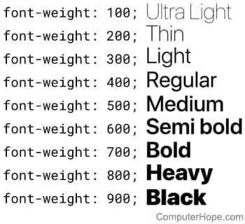
Finally, if you find that your font is too bold, you can try using a different weight. For example, instead of using the “bold” weight, you could use the “light” weight.
Here’s a trick, if you have to use a thin font but want to beef it up a little, consider adding some shadow. A light grey shadow a few pixels outside of the characters can really make it “pop.”
Examples of Good, Thin Fonts
Now that we’ve discussed some solutions to the problem let’s look at some examples of good, thin fonts. These fonts will not make your text appear fat and are perfect for use in projects where readability is essential.
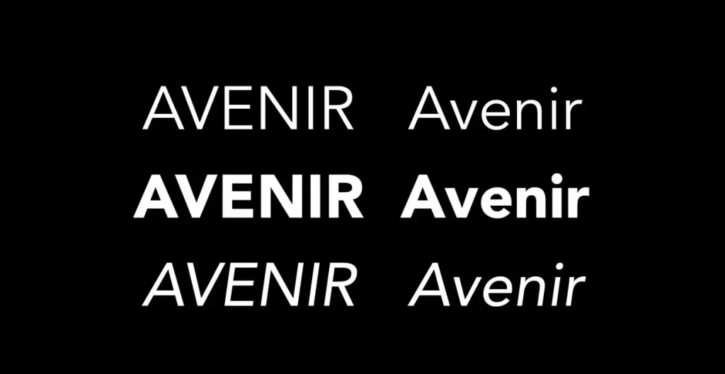
Avenir
Avenir is a thin font that is perfect for use in projects where readability is essential. The letters are well-spaced, and the font size is just right.
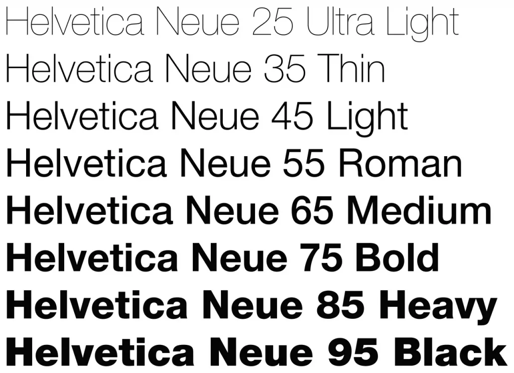
Helvetica Neue
Helvetica Neue is another thin font that is perfect for use in projects where readability is important. Like Avenir, the letters are well-spaced, and the font size is just right.
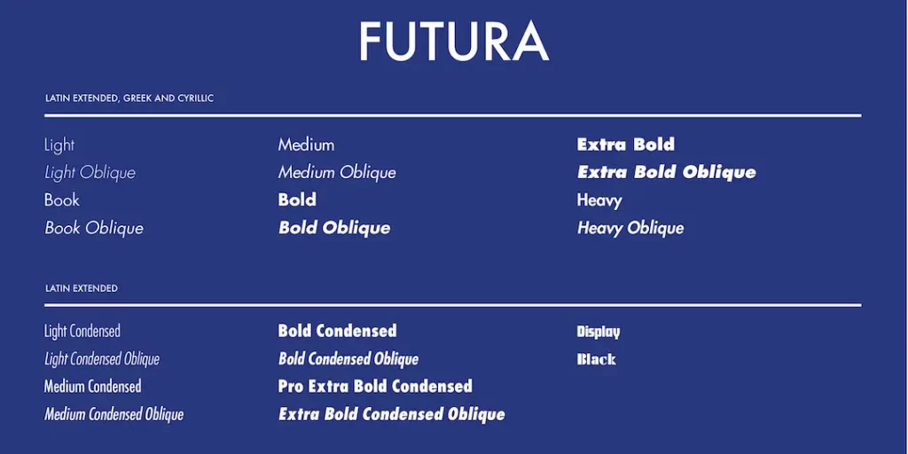
Futura
Futura is a thin font that has been around for many years. It’s perfect for use in projects where readability is essential. The letters are well-spaced and modern-looking.
Examples of Good, Fat Fonts
Now, let’s look at some examples of good, fat fonts. These fonts will make your text appear fat, but they can be used in projects where readability is not as important.
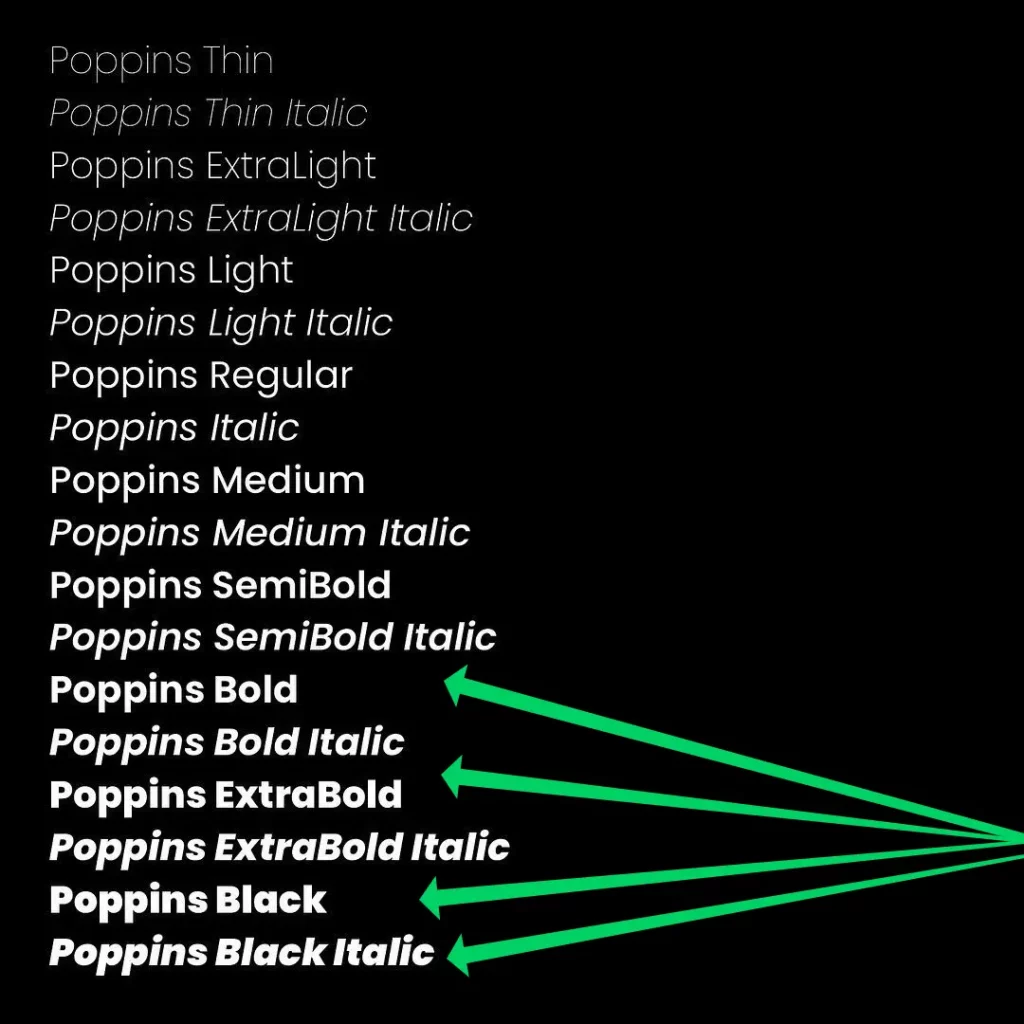
Poppins Bold
This is one of our favorite fonts around. Poppins is a popular typeface for creating websites, and it’s one of the Geometric sans serifs. With optical adjustments made to stroke joints necessary to maintain an even typographic color, each letterform is nearly monolinear.
In other words, Poppins Bold is incredible and perfectly suited for web projects that require a little more weight. Plus, you can go all of the way up to Poppins Black, and it’ll still look great!
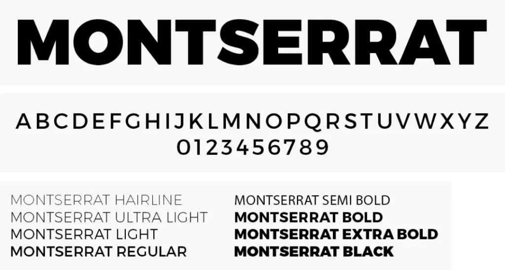
Montserrat
Montserrat is one of our favorite typefaces. It has a modernist feel similar to Futura but feels less formal. Montserrat is perfect for short pieces that are all caps and have geometric simplicity to the letters. Montserrat is also a nice typeface with a large x-height and plenty of personality compared to Arial or Helvetica.
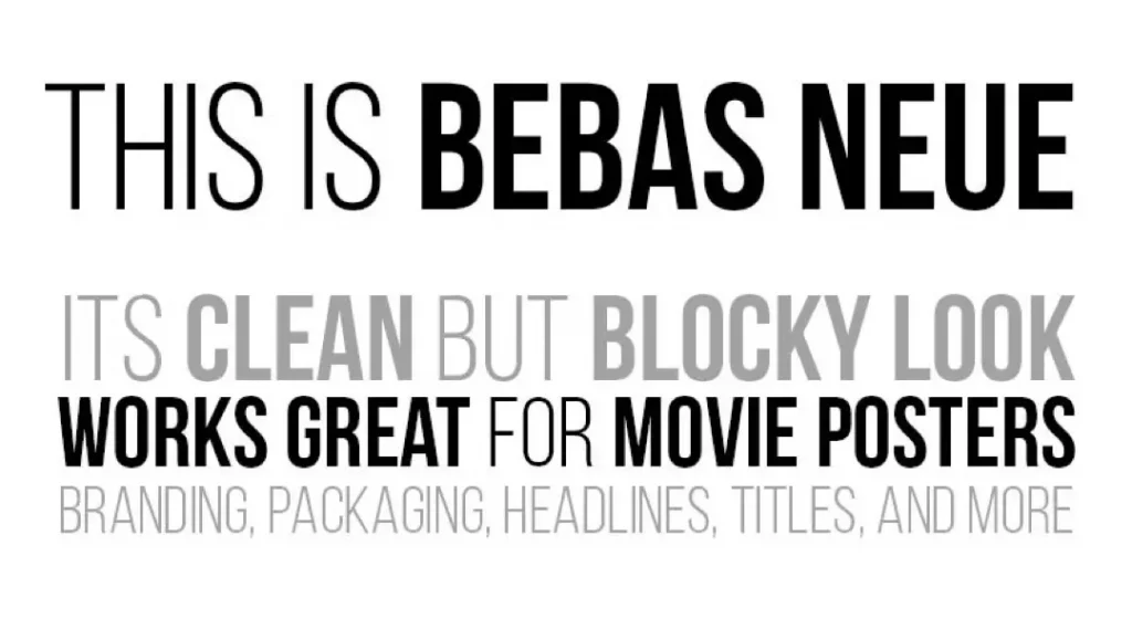
Bebas Neue
Bebas Neue is a standard-looking font perfect for projects where readability is unimportant. The letters are well-spaced, and the font size is ideal for any project.
Conclusion
Ultimately, it’s a matter of personal preference when it comes to choosing the right font for your project. However, if you follow the tips in this article, you should be able to find a font that is perfect for your needs! Thanks for reading!
What are your go-to fonts? Let us know in the comments below!
Looking for a real conversation about your business — no sales pitch, no commitment? Book a free 15-minute Discovery Call.