Web design mistakes can be catastrophic to your company. Let’s take a look at what these mistakes are, why they’re so common and how you can avoid them!
Web designers and developers spend countless hours creating the perfect website or app for their clients. The last thing they want is for something as simple as a typo or bad link to ruin everything.
However, it doesn’t always go according to plan. With all the different browsers out there on various operating systems, there’s no guarantee that people will see things exactly as you do in your head–especially if you’re not careful about some of these ten common web design mistakes:
Bad Design
A poor design tops the list of common web design mistakes that you should avoid.
Your website needs to be designed to be easy to use, navigable and responsive to all different screen sizes.
When deciding on a design, you need to pay attention to the content–not just how it looks.
Effects of Bad Design:
- People will spend less time on your site, resulting in a lower conversion rate.
- They may get frustrated and leave your website altogether.
- Potential customers could perceive that your business is disorganized or inferior to others.
Examples of Bad Design:
- A cluttered design.
- Unnecessary animation (unless your site is designed for kids).
- Textual Errors/Grammar Mistakes
How to Avoid Bad Design:
- If you don’t know how to design websites yourself, hire someone who does.
- Make sure that your designers understand the purpose of your site and what the content is about.
- Ensure that they ask you all the right questions to plan everything out before designing.
Your designer should also take advantage of online web design tools, such as wireframing tools, that will help them visualize what your website will look like before it’s built.
If you take the time to find someone who knows what they’re doing, you’ll benefit in the long run, and your site will be precisely what you envisioned.
Do you have a website that needs redesigning? Here are some signs that you may.
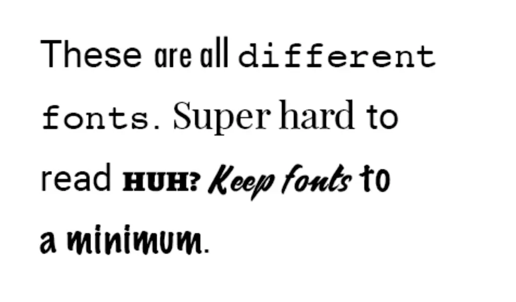
Bad Typography
Choosing web fonts is one of the most common errors in web design. Whether your text is too small or too big, it can make or break your website.
You need to make sure that the text is easy to read and doesn’t hurt your eyes when reading it.
Also, you need to consider things like letter spacing and white space to create clear content blocks that are aesthetically pleasing for your audience.
Effects of Bad Typography:
- It can be hard to read.
- It takes away from your site’s professionalism.
- Your website won’t look as polished as it could.
Examples of Bad Typography:
- Using too many different styles and fonts at once.
- Choosing the wrong color scheme for your background or text (for example, selecting black text on a black background makes it hard for people to read).
- Choosing Fonts that are Hard to Read
How to Avoid Bad Typography:
- Choose one to two font families to use throughout your website. This is a classic design approach that has been used for decades, and it’s proven to be effective.
- You can then accentuate this with a couple of different styles within the same family, including italics and bold.
- When choosing a font, try using different sizes to determine what works best for your content.
- If you’re someone who likes more minimalist web design, then choose bold fonts that are easy to read on top of light backgrounds with enough white space, so your content is clean and legible.
Good typography can’t fix a bad design, however. You need to make sure that your site is set up in a way that makes your content easy to read no matter what browser or device someone is using.
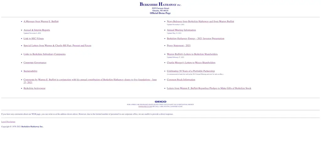
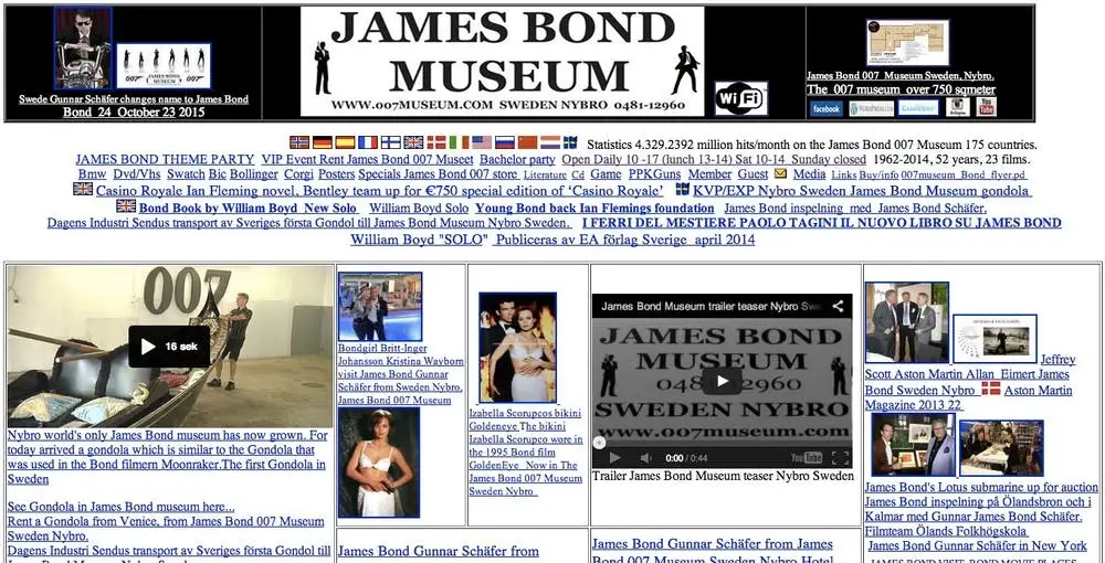
Bad Navigation
Navigation is one of the hardest things to get right in web design. If it’s too hard to use, people won’t find what they need.
The above example from Berkshire Hathaway shows what not to do.
Make sure that your navigation is easy to read and quick to access. Incorporating this into your design seamlessly will help you create a website that your users will love!
Does your company need a website? Is your navigation all hard to use? Visit our pay-per-month website options that are easy on your wallet.
Effects of Bad Navigation:
- People will be frustrated trying to find what they’re looking for.
- They may just abandon your site entirely since it’s too hard to navigate.
- They may not be able to find out more about what you’re selling or offering.
Bad Navigation Examples:
- Poorly labeled links that don’t give the reader an idea as to where they’ll end up (i.e., “Click here”).
- Links that don’t work or don’t lead to the correct information.
- Not enough links on the page, which makes it difficult for users to find what they’re looking for.
How to avoid Bad Navigation:
- Make your website’s navigation intuitive and easy to use.
- Ensure that everything is clearly labeled, so visitors know exactly where they’re going.
- This isn’t limited to the navigation bar either – menus, buttons, and links should all be self-explanatory and direct users where they need to go.
You can even take this one step further by creating breadcrumbs that tell the user exactly where they are on your site.
Navigation is the backbone of your website. If you don’t get it right, then the rest of your site will suffer as well.
Mobile Issues
Most of us are browsing on our mobile devices or smartphones these days–that’s why it’s imperative to make your website interface easily adaptable.
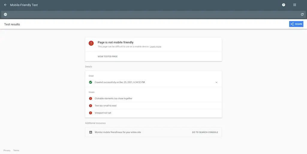
Whether your button is too small for them to press quickly or the font is simply unreadable, you don’t want people having problems accessing the information they need on their mobile devices.
Examples of Mobile Issues
- Pages that take a long time to load on mobile devices.
- Images that are too big or spaced incorrectly make it difficult for users to find what they’re looking for.
- Text that is too small and hard to read with one hand while holding the phone.
How to Avoid Mobile Issues:
- Use a responsive web design so all of your content will scale accordingly on every device.
- Use media queries to create fluid grids that are easy to resize.
- Make sure images are optimized and don’t take too much time to load.
- Test your website on as many different devices as possible, even if you think it will look fine.
Mobile-Friendly Web Design isn’t optional anymore. It’s the standard now, and it will save you money in hosting costs and help grow your customer base.
Is your website outdated, or not mobile-responsive? We can help! View our web design and development services page to learn how we can help.
No SEO
SEO helps improve your site’s rankings in Google or Bing, making it easier for people to find you.
Good SEO helps keep visitors on your website and increases your ranking overall, which means more people are visiting! Just make sure that you’re placing the right keywords in the right places (title tags, URLs) and using alt tags for images, and you’ll be good to go!
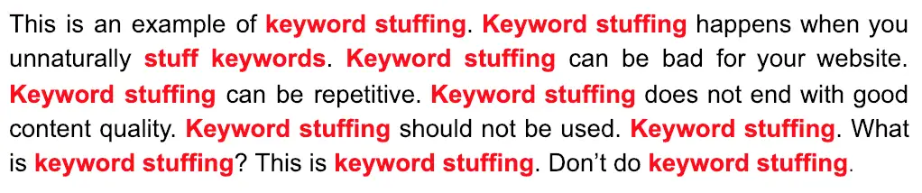
Bad SEO Examples:
- Keywords stuffed everywhere or repeating the same keywords excessively.
- Images with no alt tags, which make it difficult for search engines and readers who are impaired to find them and understand what they’re about.
- Overly complicated URLs that are hard to read and even harder to remember.
How to Optimize Your Website:
- Find the right keywords that will be easy for people to find.
- Make sure to place them in strategic locations within your content (title tags, URLs, images).
- Keep it short and sweet! URL should make sense if you were telling someone about it.
- Add alt tags to your images so people, as well as search engines, can find them.
SEO is crucial if you want more people to visit your site and keep visiting!
Are your SEO efforts coming up short? Use our free SEO audit tool to get actionable tasks that you can take today to boost your website’s rankings.
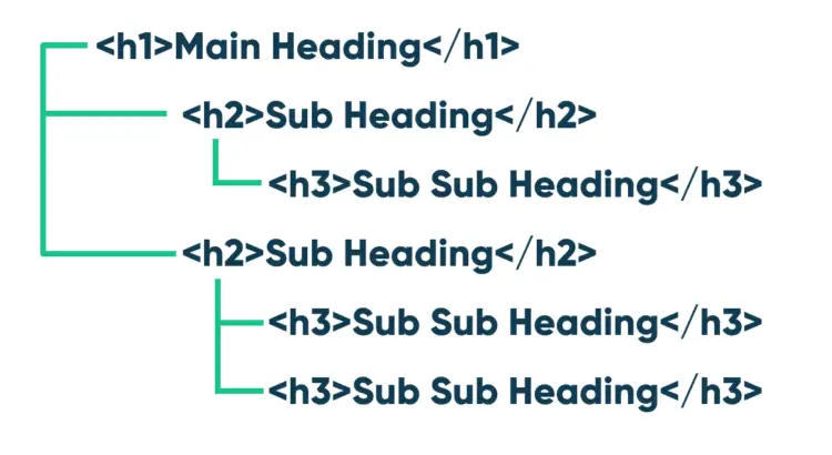
Improperly Used Headings
Headings are an excellent way to break up your content and make it easy for your audience to read.
However, you need to use them properly based on their hierarchy. Use h1 tags for page headings and then h2-h6 as subheadings that go into further detail. Using the wrong heading level can throw Google off and make your website look less professional.
Bad Use of Headings
- Using the same heading throughout an entire page.
- Including headings that are too deep or shallow to be helpful.
- Using headings to style your text instead of to help break up your content.
How to Use Headings Properly:
- Use h1 tags for your main heading–make it stand out! Only use one h1 tag on a page.
- Use h2 tags for subheadings–these should be the secondary-most important thing. Only use as many as you need, usually 2 to 3 deep.
- Use h3 tags for smaller headings–still an important part of the information, though not as big as h2 or h1 tags.
- Don’t just use headings as a way to style your content–use them for what they’re intended: to break up large chunks of text and make it more organized and easier to read! And if you want to get even fancier, look into using CSS like drop caps or larger font sizes.
Headings, when appropriately used, make your website look more professional and accessible to your readers.
That doesn’t mean you can use headings to style your content! Make sure they add to the ease of reading instead of distracting from it.
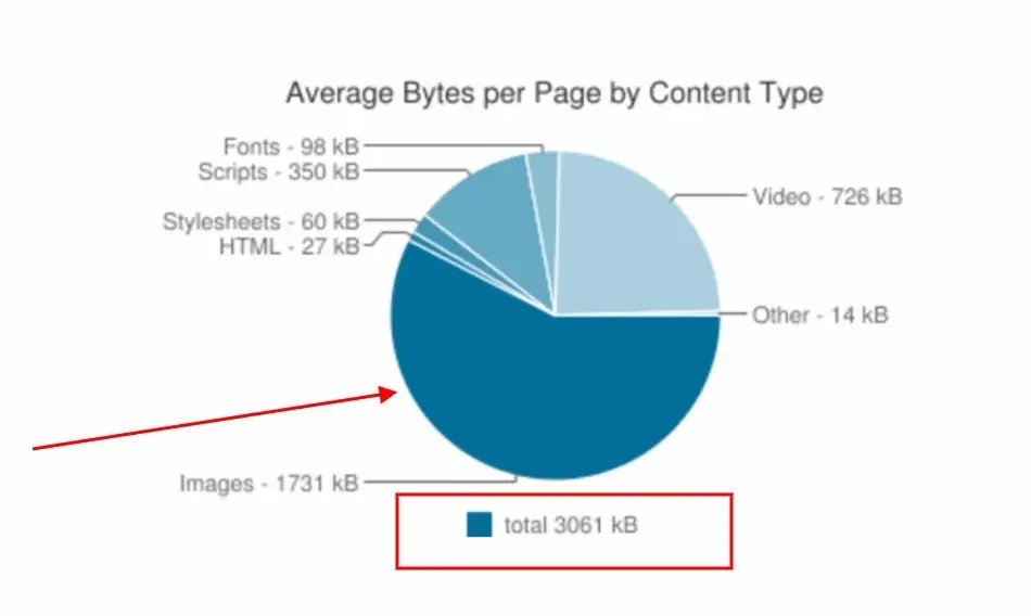
Oversized Images & Videos
If your images or videos are taking too long to load, people probably aren’t going to stick around for very long. Use smaller photos and videos that will show up quickly on any browser.
This means that you should choose the right image size for the device it’s being viewed on and compress your images without losing too much quality.
Learn more about oversized images and other technical SEO errors that could be killing your rankings in our recent blog post.
Bad Uses of Oversized Images & Videos:
- Using huge images or videos that take too long to load.
- Not compressing your images enough–meaning they look very pixelated or blurry.
- Not using the correct format for your images (JPEG versus PNG versus GIF).
How to Optimize Your Images & Videos:
- Choose the right image size that will load quickly on any browser.
- Ensure that the file type is the best for the image (JPEG for photos and PNG for graphics, like logos).
- Compress your images as much as you can without ruining their quality.
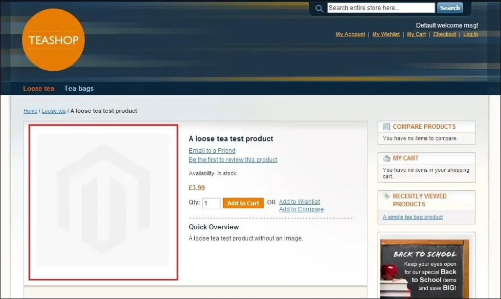
Make sure your images are relevant and add value to your content! An image like a random cat or landscape doesn’t add much, even if it’s the correct format and size.
You want people to actually read what you wrote! Use images that will enhance it.
Do you need images and videos for your website? Our professional graphic designers can help! No Canva templates here, we custom design graphics for your business and website. View our graphic design services page to learn more.
Too Much Content or Information
Having too much content is another web design mistake that can be avoided. You don’t want to overcomplicate things with useless information–you just need to get the point across in an easy-to-understand way.
Make sure your website is easy to digest, and people won’t get overwhelmed when they’re trying to access the information they need.
Bad Uses of Too Much Content or Information:
- Putting content that doesn’t belong on the website, such as random images or videos.
- Writing too much text for people to read through–it needs to be concise and easy to understand.
- Not having enough white space around your content, so it’s overwhelming to look at.
How To Avoid Too Much Content or Information:
- Only put content on your website relevant to the audience and adds value.
- Don’t write too much text–choose just a few words for an effective paragraph.
- Ensure there is enough white space around your content so it’s not overwhelming and people can still easily access it.
Remember that the whole point of having a website is to deliver an idea or message. Don’t be vague–be clear!
Need help writing content for your website? Our professional copywriters can craft high-converting copy for your website guaranteed to increase conversions. Visit our copywriting services page to learn more.
Stay On-Brand
Your brand should always be identifiable in your web design, whether it’s in the header or footer of your site.
You need to make sure that everything you do ties into your overall company vision so that your branding becomes recognizable and encourages others to become customers.
Learn more about the importance of branding in our recent blog post.
Bad Uses of Not Staying On-Brand:
- Having a header or footer that doesn’t match the rest of your website.
- Using colors in your text, images, or videos that don’t relate to your company’s colors.
- Not using fonts that go along with the branding of your company.
- Not using logos in the correct way or that matches your branding.
How To Avoid Not Staying On-Brand:
- Have a header and footer on every page of your website to keep it cohesive with your overall brand.
- Use colors, fonts, and logos that fit into your current branding, so it’s recognizable when a user is on your site.
- Make sure to use your company’s logo in a way that’s cohesive with the branding you already have!
Your brand is what will represent you online, so make sure it’s cohesive and user-friendly.

Not Offering a Clear Call to Action
A web design mistake that you can easily avoid is not offering a clear call to action for your audience.
People need to know what you want them to do and where they should go next on the site–this is why it’s crucial to have a clear call to action for them!
Bad Uses of Not Offering a Clear Call to Action:
- Having no call-to-action, such as having no tempting text or image that makes people want to go somewhere.
- Not attaching your social media buttons so people can easily follow you on different platforms.
- Having a call-to-action that doesn’t accurately suggest what you want your audience to do.
How To Avoid Not Offering a Clear Call to Action:
- Always include a call-to-action for your users, so they know where they’re supposed to go next.
- Make sure that the text or image of your call-to-action is enticing and that it’s enough to catch someone’s attention.
- Make sure that clicking your call-to-action will lead users to the right place–don’t make them click an image or text for no reason.
- Always attach social media buttons so people can easily follow you on different platforms, such as Twitter and Facebook.
Your website is there to lead people to the right place, so always offer a clear call to action.
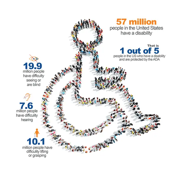
Not Accessible to All Users
Making sure your website is accessible to all users, even those with disabilities is a good idea. People who have some kind of impairment or disability might not be able to access certain parts of your site without the proper accommodations.
Examples Of Not Meeting Accessibility Requirements:
- Not using colors based on WCAG (Web Content Accessibility Guidelines) standards.
- Having text that’s not visible enough to people with poor vision or who are colorblind.
- Using images as your navigation without alternative options like keyboard shortcuts or all-text links.
- Not having a clear distinction between what’s clickable and scrollable.
How To Avoid Not Meeting Accessibility Requirements:
- Make sure to use colors based on WCAG standards so people with poor vision can still read it.
- Use text that’s visible enough for people who are colorblind or have other visual disabilities.
- Don’t use images as your navigation without including alternative options, such as all-text links.
- Make sure to have a clear distinction between what’s clickable and scrollable for a smooth navigation experience on your website.
- When designing a website, be sure to accommodate people with disabilities so they can use it as well!
Web accessibility is something that you should always consider when designing a website. If not, you risk alienating many potential users and setting your company up for lawsuits.
Complete the form below for your free website accessibility audit.
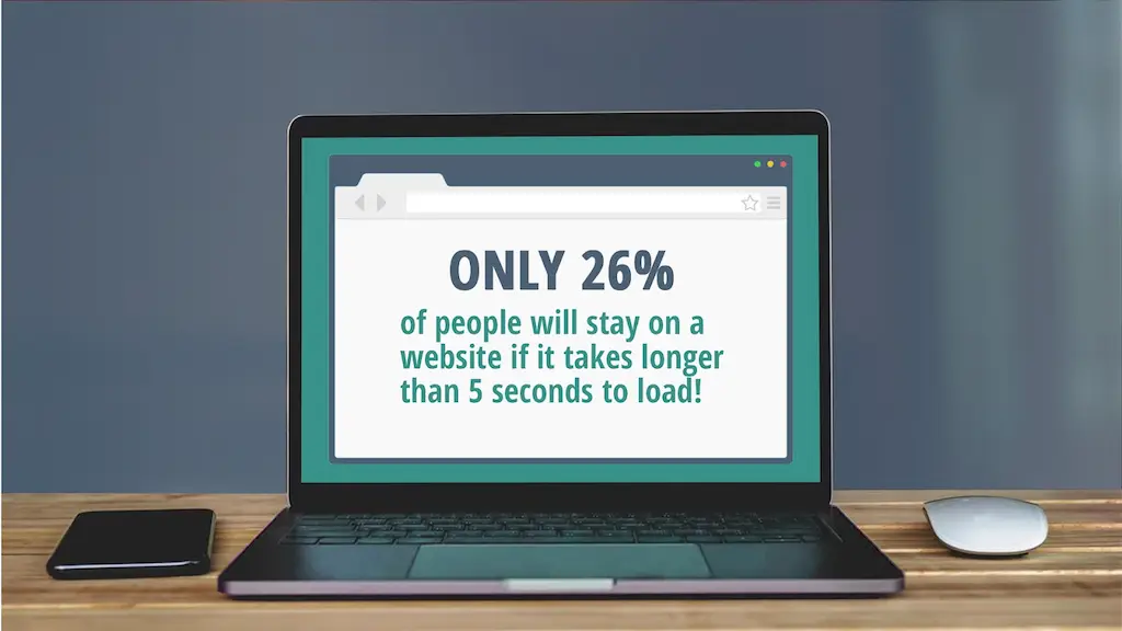
Slow Loading Speed
If you have bloated code or too many bells and whistles that take forever to load, people will probably leave. Nobody wants to wait for a website to finish loading with beautiful images–they just want the information they need!
Just make sure you’re not using unnecessary graphics and streamlining your site so it loads quickly.
Examples Of Slowing Down a Site:
- Having “pretty” images or graphics that aren’t compressed.
- Not having proper optimization for mobile browsers.
- Having too many external scripts and resources (fonts, videos, etc.) can slow down the site’s load time.
- Using too many animated GIFs on your site can take up a lot of space and slow down the load time.
- Not having proper hosting or server resources for your site can also slow it down.
How To Avoid Slowing Down Your Site:
- Only use the plugins that you need, which won’t slow down your site.
- Limit the number of external scripts.
- Make sure all images are compressed so they don’t take up too much space.
- Use only the necessary scripts, fonts, videos, etc., on your site because these can slow download times.
- Don’t use any animated GIFs on your site–they’re big, inefficient, and slow.
- Ensure you have the proper hosting for your website to avoid any slowdown issues.
Nobody likes waiting forever to see a website. If your site loads slowly, then your visitors will probably leave. Make sure to streamline and optimize your website to ensure that it loads quickly and efficiently!
Lack of Information
Finally, you need to make sure that your website has enough information for visitors. If all they’re seeing is a splash page with no direction or helpful links, they probably aren’t going to stick around.
Make sure you have good meta-descriptions and page titles so that people know what the site’s about and what to expect. (Plus it helps with your on-page SEO)
Examples Of Not Providing Enough Information:
- Having a splash page that consists of an image with no links or other helpful information.
- Having a site that looks nice but doesn’t have any actual content on it, just placeholder text or images.
- Having too few pages on the website so people don’t know where to look for specific information.
- Having a site that provides a nice design but no actual information or content about the company.
- Not having meta-descriptions and page titles tailored for specific keywords related to your business.
How much information should your website have?
It’s up to you and the industry that you’re in!
However, it’s always advisable to provide as much information as possible so people can learn about your company and what it does. Put yourself in the place of your visitors and ask, “If I was them, would I want to stick around?”
“Not enough information” is code for “I’m not interested–your website’s pointless.” That hurts!
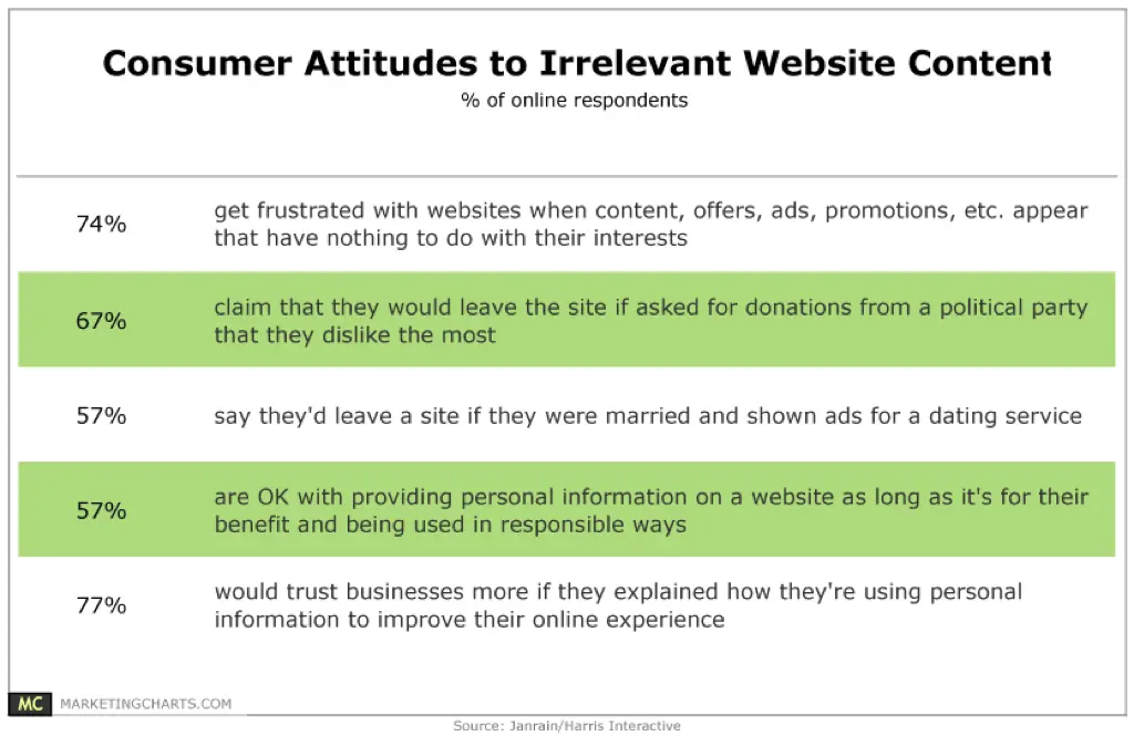
Irrelevant Content
When you have a bunch of content that doesn’t relate to your website or your overall business, people will realize that there’s something fishy going on.
Make sure all of the content on your website is relevant and provides value to the reader.
Examples Of Having Irrelevant Content:
- Having a website with a lot of content about a completely different industry or topic.
- Having a site with broken links so people can’t find important information.
- Not having all site pages linked together, so visitors have to click the “next” button repeatedly to get from one page to the next.
- Having a site filled with keywords and not basic information about your business, which results in it being seen as spam.
How to avoid having irrelevant content:
- Double-check that all of your website’s content relates to the same topic or industry.
- Check that there aren’t any broken links on the site.
- Link all of your pages together, so people don’t have to click through multiple pages just to get from one page to the next.
- Make sure that the material you’re putting on the site is helpful and relevant to your business.
Your content is the basis of your website–if it isn’t relevant, you can’t expect to have a successful and informative site.
All filler and no killer will result in an empty and pointless website that nobody wants to read or visit.
Inappropriate Content
You also don’t want inappropriate content displayed anywhere on your site. This includes both images and text that might waste people’s time or offend them. If something doesn’t add value to your site, take it out immediately!
Examples Of Having Inappropriate Content:
- Having a website that has a bunch of random, adult-themed pictures.
- Having pages filled with swear words and offensive language just for the sake of being edgy.
- Not having any disclaimer or warning about the type of material on the site, so people know what they’re getting into.
- Having a site with bad grammar and spelling, which makes the site look unprofessional.
How to avoid having inappropriate content:
- Don’t have any kind of adult material anywhere on your website (unless that’s your niche, of course).
- Don’t try to be edgy and offensive just for the sake of being offensive–it generally ends up making you look unprofessional.
- Make sure your site is safe for work and isn’t going to offend anyone.
- It’s OK to have pages with some “bad words” on them, but use your best judgment and make sure those pages are hidden from children and anyone who would be offended by the content.
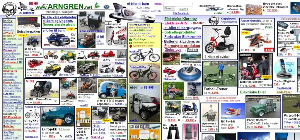
Unorganized Layout
Finally, you need to make sure that the overall layout of your website is organized in a way that makes sense. You shouldn’t have been put together sections on top of one another or have content that’s hidden away.
People should be able to find what they need quickly and easily, so use a top menu and links to help them.
Examples Of Having An Unorganized Layout:
- Having left and right sidebars filled with random links to completely different websites.
- Having site content that is hidden away, so people have to click on tabs or “more” buttons to find it.
- Having a website with menus and sub-menus all over the place, which confuses people and makes them not want to explore your site.
- Not having any kind of menu navigation, just random links spread out everywhere.
How to avoid having an unorganized layout:
- Put your important site content in the main section of the page, not in some sidebar or hidden away.
- Don’t have random links all over the place–have a good menu top navigation so people can get what they need quickly and easily.
- Make your website easy to explore, and don’t be afraid of putting important content up front.
Conclusion
Web design mistakes can happen to anyone, especially if they do it themself. It’s incredibly easy for these mistakes to slip through the cracks without noticing if you don’t have the proper guidance.
However, if you avoid these common web design mistakes, your site will be more organized and pleasing to the eye. People are more likely to return for future use if they enjoy using your website!
Anyone can make a website look nice with pretty graphics and good page titles, but it takes professional web design to make sure these mistakes are avoided.
If you’re looking for some extra help, you can hire a professional web designer like us. Here at BlakSheep Creative, we can craft unique websites to exceed your expectations and avoid these common web design mistakes.
Don’t hesitate to reach out if you want to know more about what we do! You can contact us on our website or by filling in the form at the bottom of this page.
Thinking about a new website, redesign, or rebuild? Talk through the project before you spend a dollar — 15 minutes, no sales pitch.