Alright, folks, buckle up for a safari through the badlands of cyberspace, where web design principles go to die, and SEO tactics of yore roam free in a lawless land of keyword stuffing and meta mayhem. Ready your screenshots because this one’s for the digital history books—or at least for a hearty laugh over your next Zoom happy hour.
Here’s an image of the website. We’ll explain why all of these red marks are bad in the following content:
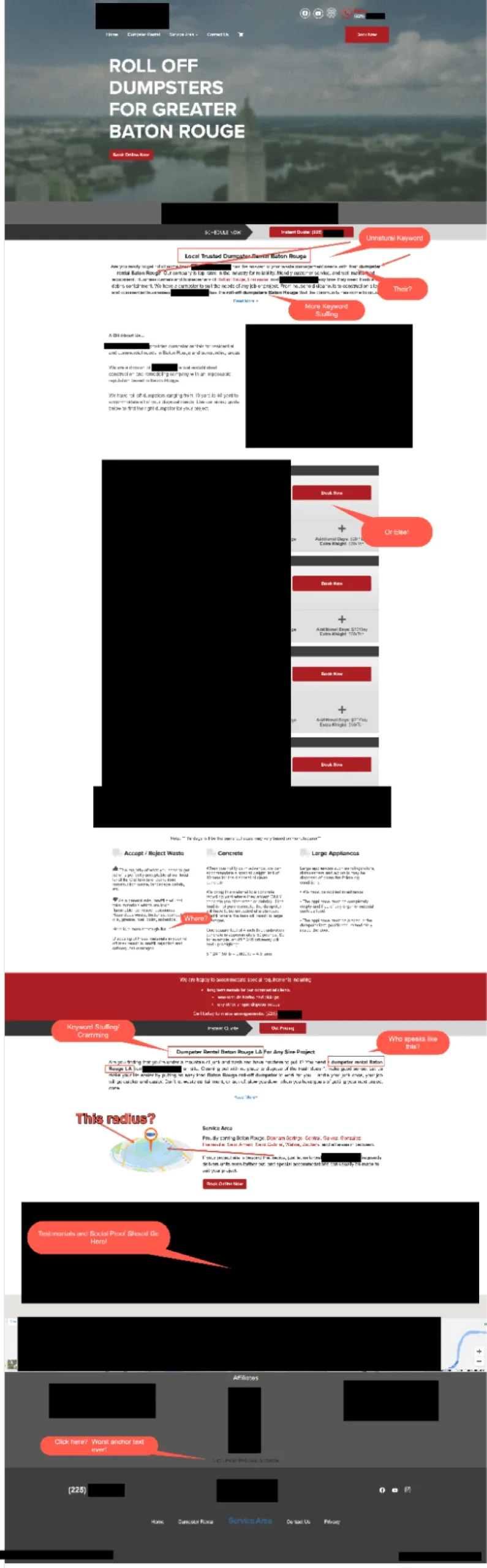
Keyword Cramming: Because Who Needs Breathing Room?
First, we’ve got headings that hit you with the subtlety of a neon sign at a meditation retreat. If keywords were dynamite, this website just blew up the whole quarry. It’s as if they were trying to game the Google gods with a smoke signal, except the signal is made of blazing tires, and your search intent is the fire extinguisher.
The Hall of Forced Keywords
In our cavalcade of SEO carnage, let’s not gloss over the pièce de résistance of this digital disaster: the forced, unnatural keywords. The phrases “Local Trusted Dumpster Rental Baton Rouge,” “Dumpster Rental Baton Rouge LA For Any Size Project,” and “roll-off dumpsters Baton Rouge” stick out like sore thumbs at a hand model convention. They’re so awkwardly inserted into content that you can almost hear the sound of a marketer checking off their SEO checklist with glee.
Let’s break it down: “Local Trusted Dumpster Rental Baton Rouge” is less of a sentence and more of a Frankenstein’s monster of keywords. You can almost see the bolts sticking out. It reads like someone spun a wheel of fortune of local SEO terms and used whatever came up; context be darned.
Then there’s “Dumpster Rental Baton Rouge LA For Any Size Project.” This one’s a hoot—it tries to do so much heavy lifting that it pulls a muscle. They couldn’t decide on a keyword, so they just threw them all in and hoped for the best. Spoiler: it wasn’t the best.
And who can forget “roll-off dumpsters Baton Rouge”? This term reads as if it were written by a robot that’s never had the pleasure of conversing with a human.
It’s so stiff and robotic you’d think it was auditioning for a role in a B-grade sci-fi flick. This is the exact trap businesses fall into when they use automated builders. You should read why AI-generated websites hurt your business by making your brand sound just as disconnected as this example.
Adding these to our keyword carnival only illustrates the point: stuffing keywords like a Thanksgiving turkey doesn’t make for palatable content. It’s about as appetizing as a plate of plastic fruit—it looks good from a distance, but one bite and you’re in for a bad time.
This kind of keyword abuse is a tell-tale sign of someone attempting SEO without the necessary specialized knowledge. It’s a common outcome when a web design project includes an “SEO package” as a simple add-on, rather than as a dedicated, strategic service from a knowledgeable practitioner.
CTAs on Steroids: Click Here or Else!
Let’s talk about those CTAs—those loud, demanding beasts that lurk between the lines. “Book Now” isn’t just a suggestion; it’s a command. You half expect the button to reach out of the screen and slap you with a “Proceed to Checkout” if you don’t comply. Subtlety? Nuance? Never heard of ’em.
CTA Faux Pas: A Case of Static Shock
The CTAs on this webpage are like relics of a bygone era where static was chic and interactive was a concept as foreign as smartphones to the Flintstones. “Book Now” they shout, with the desperation of a street vendor hawking wares to uninterested passersby. But in a world where actions speak louder than words, these CTAs are practically miming.
The Unbearable Heaviness of Non-Clickable Numbers
Here they are, phone numbers displayed like modern art in a gallery of missed connections. These strings of digits, so full of potential yet lacking functionality, sit untouched and unloved. Users arrive full of hope, ready to engage, only to be met with the equivalent of a dial tone in a digital abyss.
User Experience? More Like User Exasperation
Imagine a bright-eyed and trusting user believing in the magic of technology, only to have their tap-tap-tapping on the phone number yield nothing. The UX here doesn’t just drop the ball; it launches it into orbit. It’s a UX faux pas that leaves users feeling more abandoned than a left sock after laundry day.
Dialing Disasters: The Conversion Killer
In our click-to-call universe, this website is stuck in a dial-up daydream. A potential customer’s journey from interest to action is blocked by the simplest of oversights—hyperlinking a phone number. This isn’t just an inconvenience; it’s a digital detour straight off the conversion cliff.
The Sound of Silence: Missing Click-to-Call Symphony
Each unclickable number is like a note in a symphony that never gets played, a silence where there should be the sound of connections being made. It’s the missed beat in the heart of the sales process, the skipped step in the dance of customer engagement.
The Click That Never Was
In the tale of CTAs, this website is the one that got away—quite literally. With no links to make those phone numbers sing, we’re left with a chorus of what-ifs and a haunting melody of clicks that never were. It’s an ode to the old school, a testament to the times when phones were just phones and a clickable CTA was the stuff of science fiction.
Mobile Fiasco: Thumb Wrestling Champion 2024
Then there’s the mobile ‘experience’—and I use that term as loosely as the regulations on deep-fried butter. If you love playing ‘find the hidden menu’ or ‘mystery meat navigation,’ you’re in for a treat. This site will have your thumbs in a twist faster than you can say “carpal tunnel syndrome.”
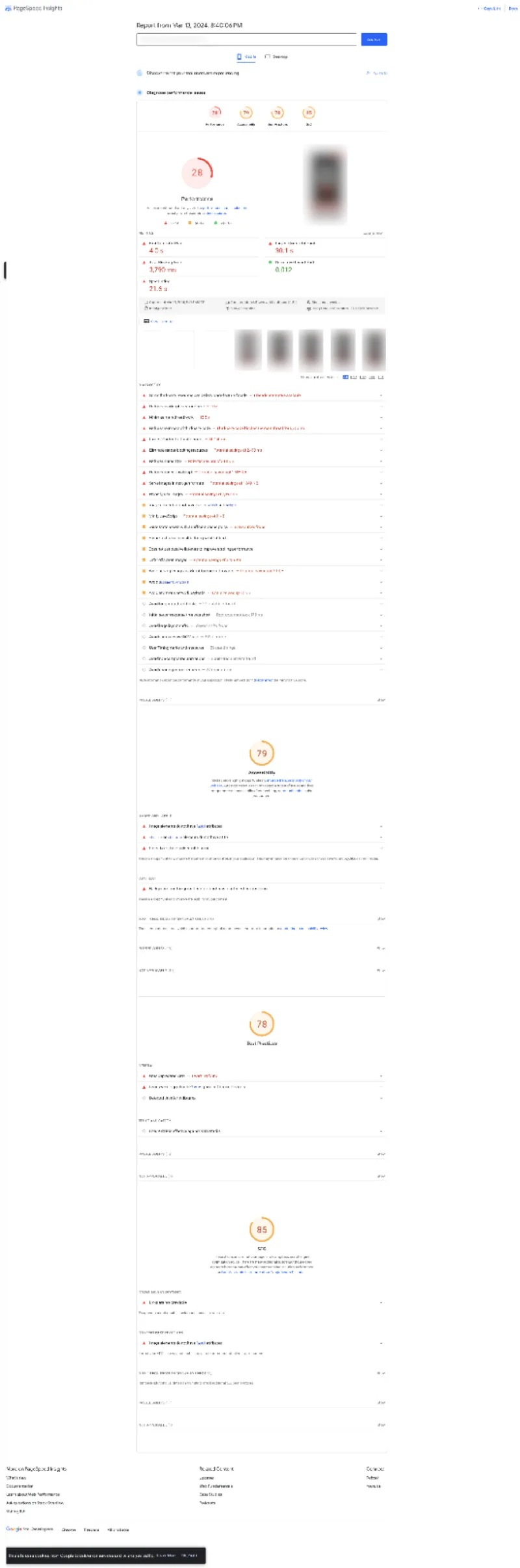
Mobile Mayhem: Crawling Through the Pagespeed Jungle
Let’s slip into the world of mobile optimization—or, in this case, the lack thereof. This page has managed to score the digital equivalent of a tortoise in a marathon. With a performance score that wouldn’t even pass in elementary school, we’re not just lagging; we’re practically going backward in time.
Performance: The Tortoise’s Slothful Cousin
The Pagespeed Insights have spoken, and they’re telling a tale sadder than a country song. With a performance score of 29, this site moves slower than a snail navigating a salt flat. It’s the internet equivalent of trying to stream a 4K video with dial-up internet. Your users have time to make a cup of coffee—or maybe even a three-course meal—while they wait for the page to load.
First Contentful Paint: Watching Paint Dry is Faster
And behold, the first contentful paint timing, a moment so delayed it could be declared a new geological epoch. At 3.4 seconds, you could have evolved from homo habilis to homo sapiens and still be waiting for something to appear on screen.
Speed Index: The Long Road to Nowhere
As for the speed index, we’re trekking through the treacherous peaks and valleys of the internet at the breakneck speed of… well, whatever speed 7.7 seconds represents. It’s the digital odyssey no one signed up for, a long and winding road that leads to the land of frustrated users and abandoned carts.
Largest Contentful Paint: The Last Dinosaur Standing
The Largest Contentful Paint is the final nail in the coffin of user patience. At 16.2 seconds, it’s not just a metric; it’s a test of human endurance. In the time it takes for the page’s main content to load, civilizations could rise and fall, empires could crumble, and somewhere, a user could have actually finished reading “War and Peace.”
Total Blocking Time: The Art of Not Moving
Total Blocking Time clocks in at a staggering 3,570 ms, making it clear that this site has mastered the art of standing perfectly still on the internet highway while everyone else moves on by. It’s like the webpage equivalent of a mime—except, it’s not entertaining.
Time to Interactive: Bring a Book
Lastly, the Time to Interactive is a whopping 27.1 seconds. Yes, you heard that right. By the time the site becomes interactive, you could have filed your taxes, learned a new language, or, at the very least, reconsidered all your life choices that led up to clicking on this URL.
In Short: Need for Speed (and a New Website)
In conclusion, this mobile performance is an anthem for the ages—if the age in question is the Stone Age. With stats like these, it’s not just the users who are going away; it’s the very concept of ‘instant’ that’s being redefined. Welcome to the slow lane, where the pages are heavy, and the user satisfaction is light.
Graphics Galore: The Museum of Misfit Images
Stroll with me through the pixelated hall of fame—or should I say shame—where graphics are as forgotten as a New Year’s resolution by February. And alt text? That’s the ‘read more’ button of the internet, and this site’s gallery hits skip every time. These images are so silent you could hear a pin drop in cyberspace.

Alt-Text Amnesia
They say a picture is worth a thousand words, but here, we’ve got 16 images worth zero ALT attributes. It’s like the site’s playing charades with search engines, and spoiler alert: the search engines are losing. These pictures could be storytelling gold, but they’re just digital wallpaper without alt text.
Page Title Pandemonium: Creativity on a Coffee Break
Let’s dissect the fascinating phenomenon I like to call ‘Page Title Pandemonium.’ Our subject? It’s a website with titles so unimaginative that you’d think they were generated by a bot stuck in a loop. “Best Dumpster Rental Walker LA—Affordable Roll Off Dumpsters”—twice, because why tempt fate with variety? The titles are as identical as twins in a sitcom, distinguishable only by the URL.
This repetitiveness is more than just boring; it’s an SEO snafu. It’s like naming all your pets ‘Bob’ and expecting to call one without all of them coming running. And then, there’s the cart page—because “Dumpster Rentals | (Company Name Omitted) Roll Offs, Baton Rouge LA” screams ‘put me in your shopping cart.’
If page titles were meant to capture the imagination, these titles couldn’t catch a cold. They’re indexable, sure, but so is every word in the dictionary. It doesn’t mean you want to read them all in a row.
To the casual observer, this might seem like an innocent oversight. To the keen-eyed critic, it’s a masterclass in how to make every page blend together like camouflage in a forest. Originality, we miss you.
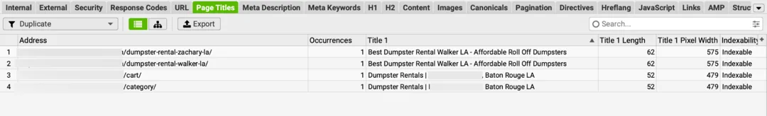
Service Area Pages: The Clone Wars of SEO
Ah, the service area pages, where creativity goes to play hide-and-seek—and always wins at hiding. We have an exquisite display of carbon-copy craftsmanship: “Best Dumpster Rental Walker LA—Affordable Roll Off Dumpsters,” stamped across multiple pages like a factory defect.
In the thrilling world of service areas, differentiation is critical. Yet, this site has decided that one size fits all, slapping the same title tag on different pages as if ‘variety’ was a concept too wild for the web. They took the ‘copy’ function a tad too literally when creating these pages for each area they serve.
It’s not just a slap in the face to the unique charm each locale undoubtedly possesses but also to the algorithms meant to savor every service area’s distinctive flavors. The search engines are hungry for diversity, and this website serves them plain toast.
What is the consequence of such monotony? A digital echo chamber where every shout for ‘Best Dumpster Rental’ bounces around unaltered, landing in the same spot every time. In a world where location-based personalization is the golden ticket, this website’s strategy is like showing up to a potluck with empty hands—twice.
One can only hope these pages don’t host a neighborhood party because guests might find themselves in a confusing episode of “Groundhog Day,” endlessly wandering from one identical ‘service area’ to another, searching for a sign—any sign—of uniqueness.
Ghost Town Testimonials: Echo, Echo, Echo…
Ah, social proof, the currency of trust in the online world. This website seems to be facing deflation because the testimonials section is emptier than a politician’s promises. Maybe the customers are just shy? Or maybe, just maybe, they don’t exist. Spooky.
A How-To Guide for What Not to Do
So there you have it—a website that’s a veritable petting zoo of everything that can go wrong when you let SEO zealots off the leash. Remember, when designing your site, do the opposite of everything you’ve just read. Unless, of course, you’re into that sort of thing—then, by all means, give us a call. We love a good train wreck.
All right, let’s dive into the belly of the beast with this screenshot and serve up some cold, hard data to showcase just why this webpage is the equivalent of a tumbleweed in the digital desert.
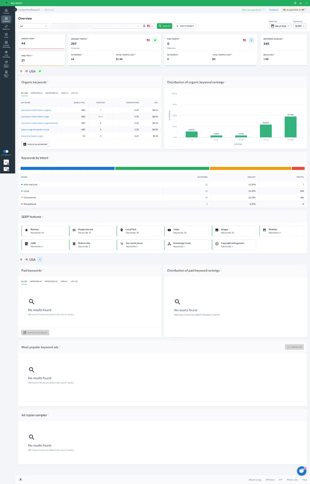
The Numbers Don’t Lie: A SEO Sob Story
Feast your eyes on these metrics – if you dare. The domain and page trust are so low they’re practically subterranean. I mean, a domain trust of 44? You get more trust points for remembering to water your plants. And let’s not forget the grand total of 297 organic keywords, with a whopping 44 of those actually ranking. If this were a game, we’d be way off the leaderboard.
Keyword Kingdom: Population? Sparse.
Now, let’s dissect this menagerie of keywords. With prestigious rankings like position 1 for – let’s face it – a search term your grandpa might use while trying to clean out his shed, it’s no wonder the website traffic is more like a back alley trickle. The competition must be shaking – with laughter, that is.
Intent to Not Rank: The SEO Strategy That Couldn’t
Moving on to intent, we’ve got a colorful little graph that seems to have mistaken ‘local’ and ‘informational’ for ‘invisible’ and ‘insignificant.’ With most keywords cruising in the no-man’s land of page two and beyond, it’s like they’ve got a cloaking device activated. It’s not exactly prime real estate in Googleville.
SERP Features: Missing In Action
And as for those SERP features, let’s just say if they were playing hide-and-seek, they’re winning. We’ve got more ‘people also ask’ entries than a conspiracy theory forum but without any actual answers. Reviews, local packs, videos? They’re more like reviews of empty space, local packs of… well, nothing, and videos that are probably just buffering into eternity.
Paid Keywords: The Empty Piggy Bank
What’s that? No paid keywords? No ad copies? It’s like the strategy here was to save money by not actually doing any advertising. That’s a bold move; let’s see if it pays off. Oh, wait, we can’t because there’s literally no data. It’s a Zen approach to marketing: the sound of one hand not clicking.
In Conclusion, Not Even a Participation Trophy
This screenshot paints a picture of digital desolation so stark you could sell it as modern art. If this site’s SEO strategy were a horse, it’d be the one you lead to water but can’t make drink – because it’s already dehydrated from wandering the wasteland of poor optimization. Here’s to hoping they find an oasis of SEO knowledge soon, or it’s just going to be more tumbleweeds and crickets.
If the digital pitfalls highlighted in this post sound all too familiar, don’t fret—it’s not high noon for your website just yet. BlakSheep Creative is on standby to extend a lifeline with a free, comprehensive website audit. No gimmicks, no catch.
Just complete a simple form, and we’ll deliver an audit directly to your inbox. We’ll dissect your site’s SEO, usability, and performance, providing you with actionable insights to help you improve. Why wait? Submit your request now and take the first step towards a website that’s not just surviving but thriving.
Wondering whether your SEO is actually getting traction — or where to focus next? Let’s diagnose it in a 15-minute Discovery Call.