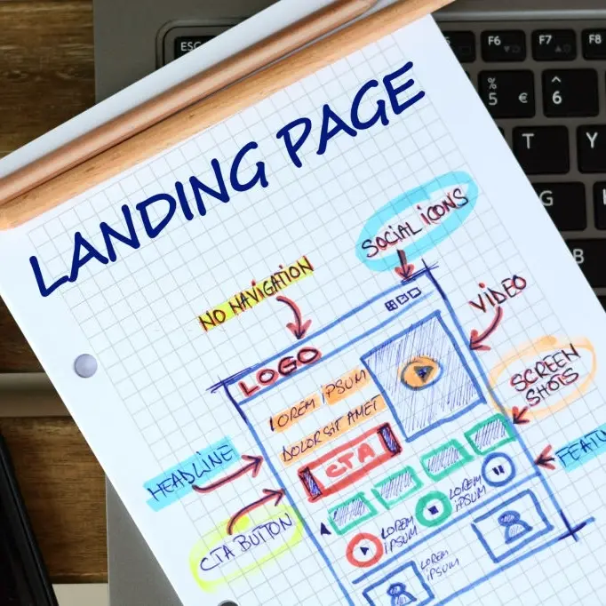

So, what is a landing page?
A landing page is a page on your site that a visitor arrives at after clicking a link. It’s a different animal than your homepage.
The link could be on a page on your website, pay-per-click advertising, banner ads, or by performing a search for a keyword.
Your landing page’s goal is to cause your target audience to take some sort of definite action.
You don’t want your visitors to leave your site until they perform the desired action that you want them to, such as:
- clicking on the buy button
- signing up for an affiliate program
- downloading a free ebook or software
- registering for a course
- subscribing to your free newsletter.
- downloading a free trial
Your landing page is an important element of direct marketing.
Your visitors landed here, and now you want to convert them.
Here are some tips for designing an excellent landing page that converts prospects into customers.
Use an awesome headline.
Now that they’ve arrived on your landing page, your headline(s) are how you keep their attention.
Make sure that they are short, simple, and result-oriented.
Follow them up with a strong subheading to further drive the point home.
Provide relevant content
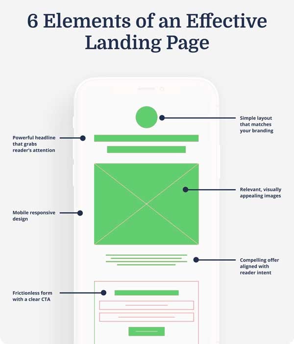
Your landing page’s content must be relevant to what people were looking for when they clicked through to it.
The closer the match is to what they’re looking for, the higher the chances of an increased conversion rate.
Offer a solid introduction.
A concise introduction paragraph lets visitors know what they can expect from the page.
Your intro should include:
- Why do you do what you do?
- What makes you unique? (Expertise, Authoritativeness, Trustworthiness)
Be Concise
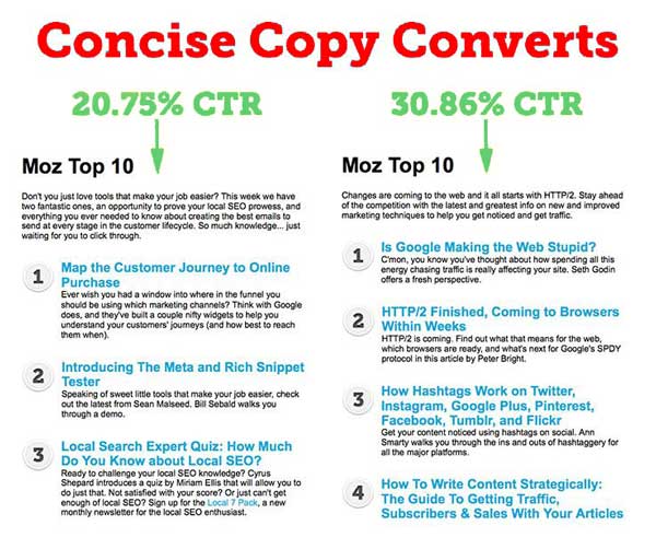
Writing for the internet is much different than offline writing.
People surfing the internet don’t read entire web pages; they scan them. Their attention span is short, so you have to be concise.
When visitors arrive on your landing page, they are already either predisposed to buy or want to get more information about the products or services that you provide.
Of course, you want to give them information, just remember to be concise.
Use the 3-second rule (If someone came to the page, could they figure out what you offer without scrolling down or clicking buttons within 3 seconds?)
Try to communicate your point in less than three sentences.
Think long and hard, and be concise about what you want to say in the shortest way possible.
Use a bulleted list to communicate the benefits of your product or service.
Offer a Clear Value Proposition (Benefit)
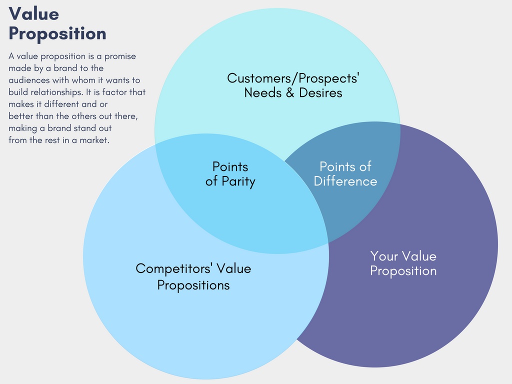
Here’s where you sell prospects on your product or service.
Consider using a bulleted list directly after some paragraph content.
Learn how to write your CPV (aka Unique Selling Proposition) on our recent blog post.
Here is an example of using a bullet point to illustrate the benefits that answer the users’ questions:
- What will I gain?
- How is my life going to be better?
Get straight to the point.

Don’t distract your visitors with advertisements or links to other web pages.
Don’t make your visitors wade through a whole bunch of garbage to find what they’re seeking.
Identify their problem and how your product or service can solve it.
Focus

Showcase only one product or service per landing page.
Don’t promote multiple products or services unless they’re in the same group on the same page.
If you have multiple products or services you’re promoting, create separate landing pages.
Focus on only one product or group per landing page.
Offer a guarantee
Show your readers that you are committed to solving their problems or issues.
Some examples are:
- Money back
- Results
- Time Frame
- Satisfaction guaranteed
Use facts and figures instead of generalities.
- General: Prices Reduced
- Factual: Prices Reduced by 20 percent
Provide social media links so that they can see social proof for themselves.
Provide a Clear Call to Action

You have to tell your visitors what it is you want them to do:
- click here to download
- buy now
- Entering their email address into a form to subscribe to a newsletter
Consider using multiple calls to action if the page is more extended but only has one on the screen at a time.
Make sure that your calls to action include landing page forms and that your phone numbers are formatted as HTML links.
Use power words in your CTA to entice them to click on them.
Your CTA should stand out from the rest of the page by:
- using bold text
- making their color the opposite of the rest of the page to draw the eye
- using images of people who are looking toward your CTA.
Learn how to write compelling calls to action on our recent blog post, “Your Website Call to Action – You Have to Ask.
Make sure your text is readable.

We realize that there’s nothing fancy about a page with black fonts on a white background.
But it’s easier much easier to read the text than a red background with black fonts.
We prefer to keep our font sizes for body text no less than 18px.
Remember, it’s the words that sell.
Your website’s visitors must be able to read your text with ease, so shoot for 8th-grade reading comprehension.
Say no to navigation links.

It’s best to have no links on your landing page if you can get away with it.
The only link you want your website’s visitors to be able to click on on your landing page is your call to action link (or button).
Minimize Graphics and Images

Keep all visual elements to a minimum, if at all possible.
Unless you’re running a business that relies on stunning imagery, try to avoid them.
They slow down page loading times and can distract your visitors.
Remember, in direct marketing; it’s the words that usually make the sale.
Graphics and images should be used to enhance your text, not cloud it.
Proofread and correct grammatical and spelling errors.
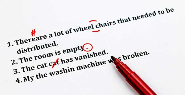
Be sure to read through your text and correct all spelling and grammatical errors. (You can use a tool like grammarly.com to help.)
If you don’t, visitors could get a negative impression of you and your brand.
Once potential customers have a negative impression, it’s challenging to convince them of the service or product that you are promoting.
Your first impression is important!
Make it personal

Use words like you and your in your text to connect with your visitors.
Make the page resonate with them by addressing them directly.
Avoid the word “we” completely. Readers don’t want to hear about you; they want to hear about themselves.
You can also build trust with your landing page’s visitors by using these trust indicators:
- Client logos
- Affiliations
- Certifications (Explain)
- Testimonials
- When including testimonials, make sure to include pictures and full names.
- Case studies – show successful results for previous clients
Make your text clear and easy to understand

Avoid colloquialisms, jargon, and technical terms.
Instead, use terms and phrases that people readily understand.
Use short sentences and phrase them in the active voice.
A well-written landing page will always sport a better conversion rate than a poorly-written one.
Think long and hard and work and rework your landing pages.
Don’t make the mistake of optimizing them for just search engines. You need to optimize for humans.
After all, it’s the humans that give you the sales.
Include a FAQ Section (For services only)
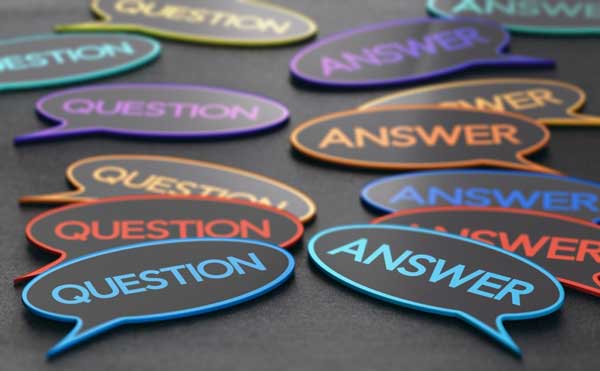
Place questions and answers in accordion tabs so that they don’t take up critical page real estate.
You want to keep your visitors from having to scroll down to read.
Make your FAQs in line with the business and its goals.
- Ask your client what the most asked questions are for the specific service.
- Perform keyword research to see which questions searchers are asking the most.
- Use the question as the title in each accordion tab & enter each answer in the accordion text body field.
Minimize page loading times

Your page should load within 2 seconds. Avoid technical errors that can destroy your SEO.
Consider the following statistics from SEO guru Neil Patel.
73% of mobile internet users say that they’ve encountered a website that was too slow to load.
47% of consumers expect a web page to load in 2 seconds or less.
A 1-second delay in page response can result in a 7% reduction in conversions.
Optimize your landing page for search engines.
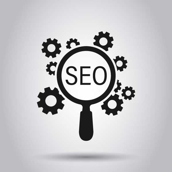
Include your keywords in the first two headers and the last header. (H1 and H2).
If at all possible, include them in the CTA header.
Also, include your main keyword in the first sentence of the body.
Make sure to place variations of your keywords in the first and last 100 words, but do not use keyword stuffing, instead write for people, not search engines – your text should read naturally.
Add local city landing pages (if optimizing for local search)

As a Baton Rouge SEO and Web Design agency, we would (and have) added local landing pages for each of our services.
You should do the same and add a small section about your city, usually 100-200 words, to let visitors (and search engines) know where you’re located.
Conclusion
Now get to work.
Design your landing page(s) and watch the results!
As usual, feel free to shoot us an email or complete the form below if we can help you in any way.
Thinking about a new website, redesign, or rebuild? Talk through the project before you spend a dollar — 15 minutes, no sales pitch.