You’ve probably heard the saying, “you get not, because you ask not,” or, “if you don’t ask, you can’t get,” or some other variation of that phrase.
The same principle is true in digital marketing.
Your website has to have compelling calls to action to help you nudge prospective customers towards conversion.
In this article, we’re going to give you an overview of what calls to action are and how you can use a call to action (CTA) on your website to increase your conversion and click-through rates.. To learn more about how you can use CTAs to increase your website’s conversions, read our recent article, “How to Build a Visually Appealing Website That Converts Like Crazy.”
What is a Call To Action?
A call-to-action, known in digital marketing as a “CTA,” is not a new idea.
Actually, the concept of a CTA has existed for quite some time.

Years ago, newspapers were the primary method that people used to get their news. Thanks to movies, we’ve all seen the images of the young men, foot perched up on a box yelling “Extra! Extra! Read all about it!”
Guess what that is? A call to action. Now let’s discuss website-specific calls to action.
What is a Website Call to Action?
According to Indeed.com, a call-to-action consists of: “Words that urge the reader, listener, or viewer of a sales promotion message to take an immediate action, such as “Write Now,” “Call Now,” “Sign Up for Free,” or “Click Here.”
Note the words in the definition above, “immediate action,” Whether you want their action to be clicking through to learn more, signing up for a newsletter, or sending you an email to get more information on your product or service, the person is taking immediate action.
Simply put, a CTA on a website should be a button or banner that stands out on the page and offers an action to be taken.
What are the Benefits of Having a CTA on Your Website?
If you have a website, chances are you want your users to do something like buying a product, learn more about your organization’s mission, or maybe sign up for a newsletter.
If you don’t have a website, we can build one for you. (obligatory sales pitch.)
But, people won’t do anything without being told to do it. Or maybe they will, but just need a little prodding. Here are some benefits to having a CTA on your website:
Boost your overall User Experience (UX)
An effective call-to-action eliminates confusion, encouraging users to take the appropriate next steps. That might be to visit a certain page or to book a call, or to read a specific article.
Direct your reader’s actions based on your organization’s needs.
By writing content for your website that has a clear call to action, your target audience has no doubt as to the intention of the content. They’re not bouncing from page to page clicking away out of confusion or boredom.
Your content creates intrigue and excitement, and your CTA allows the reader to dig more deeply into the topic or purchase your product.
Ensure that all of your created content is meaningful.

In 2020, there’s increasing pressure to create new content. All you hear from digital marketers is, “Content! Content! Content!.” Now make no mistake about it, content is king.
Or perhaps as we content marketers would say, “timely, relevant, authoritative, and useful content is king.’
By attaching a clear CTA to each new content piece (blog post, video, podcast episode, etc.), you ensure the content fits into and supports your overall marketing plan. This helps you build a larger audience, and convert them into clients or customers.
Don’t forget to provide some sort of call to action on your branding and promotional materials too!
Grow your audience and increase sales
Whether something as simple as “Follow me on Twitter” or as critical as “Submit payment,” your website’s CTA serves as a leverage point for your business’s needs.
Whatever is most important to you at the time can become a call to action. From social media posts to articles to static landing pages, each piece of content that includes a CTA becomes a powerful piece of your digital marketing efforts.
Direct your users down the marketing funnel.
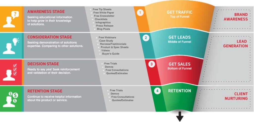
By matching your user’s intent, you can ensure that your CTA is most effective. User intent will differ depending on where they are in the funnel or the buyer’s journey. By matching your user’s intent, you can ensure that your CTA is most effective.
- Learn more about user intent in our recent post: Search Intent: What Small Business Owners Need to Know in 2020
Analyze the effectiveness of our website’s content.
The number and quality of responses we get will be indicative of how compelling our copy or content must have been.
A call-to-action could be a simple coupon in a newspaper advertisement, but things become much more interesting when we market electronically – by email, on the web, or in a blog post.
5 Call To Action Examples To Use as Inspiration
Call to action examples are everywhere, so where would you start?
We figured a good place to start would be to take a look at a few of the top companies in the world according to a recent Fortune 500 list (there has to be a reason the companies are successful, right?)
Then, we will look at some other examples that are more content-oriented.
Let’s do this.
1. Learn More With Apple
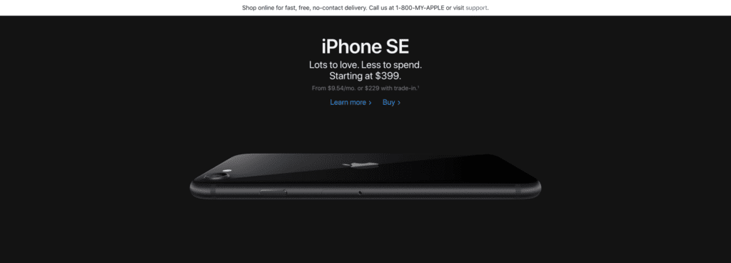
Like the simplicity of their products, Apple keeps its calls to action short, clean, and to the point
Learn More and Buy do a great job of letting Apple’s audience know exactly what they’ll see after they click through the call to action. Apple also doesn’t clutter the design: There are clearly only two options to help its users focus on making a decision to click quickly and easily.
Key Takeaway: Be clear and concise, and position your call to action as the obvious next step.
2. Save With CVS
While the design is a little busier than Apple’s example (should I click on Save with Our App, the App Store, Google Play, or on the image of the phone itself?!) CVS focuses on what we digital marketers call value proposition in their call to action.
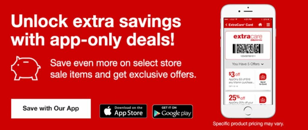
The CTA button, “Save with Our App” focuses the website’s visitors’ attention to the benefit of using the tool to meet their need to save money.
The headline here—Unlock extra savings with app-only deals!—also suggests exclusivity, that you can only experience those benefits if you get the app.
They also include the word exclusive in the description, which is a powerful motivator for the fear of missing out (FOMO).
Key Takeaway: Keep your design clean and uncluttered so your users know where to click. Brainstorm the value proposition that answers your readers’ question, “What’s in it for me?” and then tie that into your call to action.
3. Clutter is OK if you’re Amazon Prime
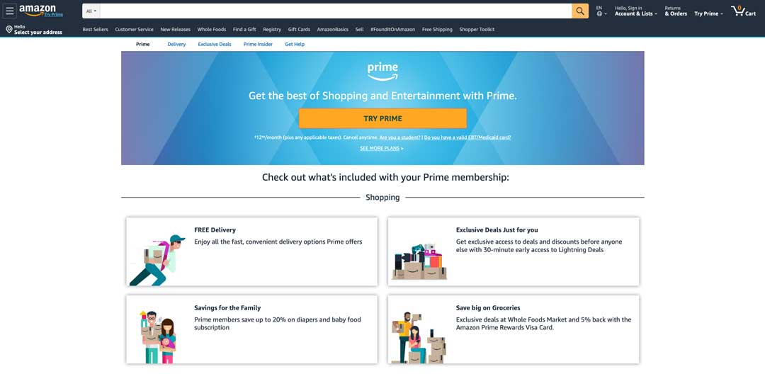
In contrast to other more minimal examples, Amazon Prime is completely opposite. This cluttered CTA for Amazon Prime sports lots of persuasive verbiage such as ‘exclusive’, ‘prime’, and ‘convenient’ in the surrounding copy to sell its package of convenience.
The CTA button itself is clear and concise, and other phrases such as ‘cancel anytime’ and ‘see more plans’ reassure customers to make them feel like they’re in control.
Key Takeaway: Use the power of persuasion to get your visitors to click through.
4. Unicef Paints a Picture
Here is an example of a charity’s use of a motivational CTA. Instead of merely asking users to donate or help out,
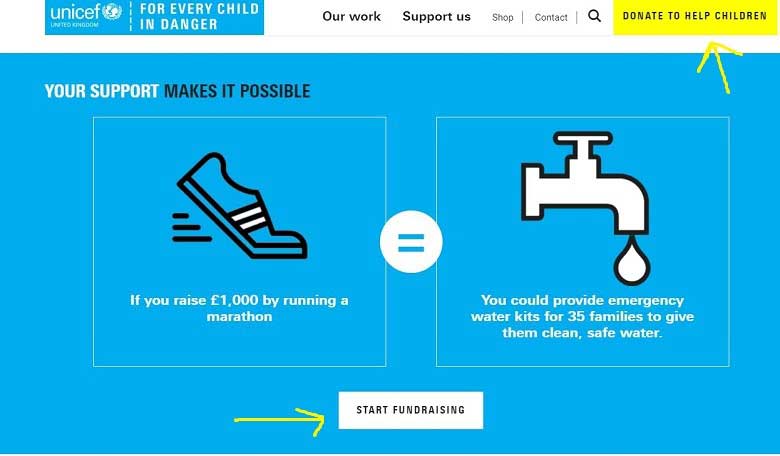
UNICEF explains the results of a specific fundraising scenario in order to inspire and drive action. This effectively paints a picture in the mind of the user.
The bright blue background not only looks great, but it leverages the visitor’s emotions as well. The color blue is said to project subtle messages of trustworthiness and serenity, loyalty, and tranquility.
Meanwhile, the bright yellow ‘donate to help children’ button catches the eye and gives the visitor a direct and immediate route to making a difference.
Key Takeaway: Write a blog post that ties into your product or service. Then end the post with an informal call to action to work with you to resolve the problems you just outlined in your post and link to content that shows your solutions.
5. Grammarly Keeps it Simple yet Personalized
If you know us, you know we’re huge fans of Grammarly.
It’s listed in our top free digital marketing tools list.
Not only is their product incredible for avoiding spelling and grammatical errors, their homepage CTA is pretty awesome too.
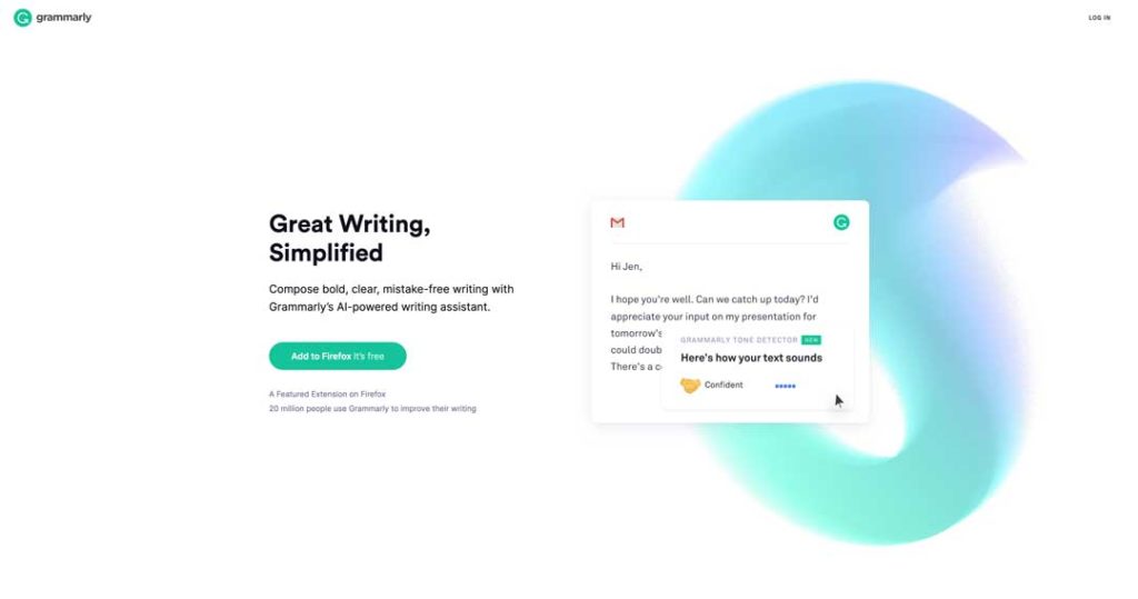
The bright and bold color ensures the “add to Firefox” call to action button stands out, while the copy cleverly includes both a prompt to add Grammarly and emphasizes the fact that Grammarly is free helps reassure people who might be thinking twice about clicking.
This CTA is also a great example of personalization, with Grammarly recognizing which browser you are using and changing the copy accordingly.
Key Takeaway: A little creativity and personalization can go a long way.
How To Write A Call To Action That Converts
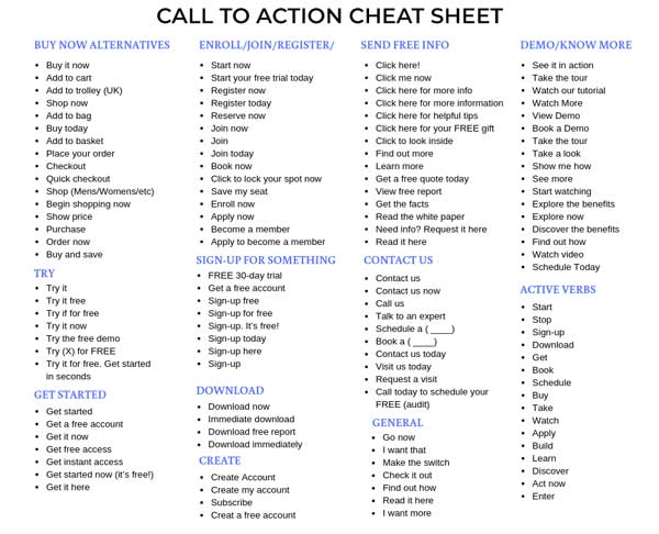
No matter what motivation you use in your call to action, here are some best practices that you should use to structure your call to action.
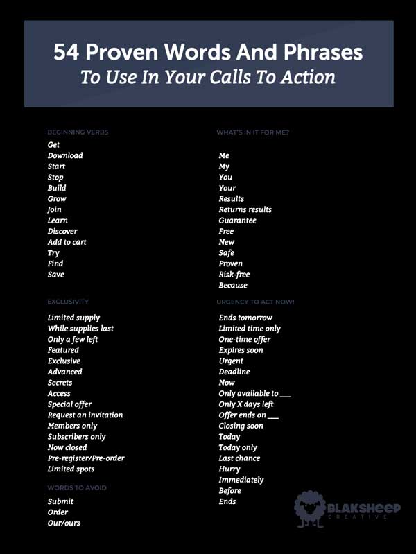
1. Start with verbs.
Verbs are the action words that make it clear to readers what you want them to do.
Instead of saying, “Ready to get started?” simplify it to “Get started now” or “Start saving now”.
By using an action phrase, you’re more apt to get your intended results.
Believe it or not, some verbs are stronger than others. This has to do with the cacophony of the word (hard K, G, D sounds) coupled with the strength of the action suggested in context.
The word “buy” feels more powerful and urgent than “purchase”. “Get your copy” feels more powerful than “Download your ebook”.
You also want to be specific with the action words you choose and the instructions that follow them.
A “feed the children,” campaign, for example, wouldn’t be effective if they just said, “help us today.”
Instead, choosing “donate to help feed a hungry child today” or “sign up to deliver food to a hungry child” are more specific, giving people exact ways they can help.
This increases the likelihood that they will.
You should also support your action words and instructions with descriptions that help explain why it’s so beneficial to the customer. “Start your free monthly trial” sounds better than “Start your trial,” Right?
2. Don’t Use Filler Words
Adverbs and adjectives can get in the way of the action you want your readers to take, so choose them selectively.
That’s why the graphic above says, “Add some adjectives,” and not, “Add a buttload of adjectives.”
You should have already done the work of convincing people to take the action before presenting your call to action to them.
Try your best to avoid words ending in -ly. “Click here” is better than “Click here quickly.”
There are exceptions, though. For example, you might hint at exclusivity by saying “Get your custom ebook now” instead of just “Get your ebook”.
3. Keep Things Short and Simple.
Make sure to use simple, common, and short words.
This isn’t because you think that your readers aren’t intelligent or illiterate.
You’re trying to prod their base emotions, and don’t want anything to get in the way of those emotions. If your reader has to process complex scenarios or thought processes, they may get distracted and not take action.
Also avoid buzzwords, jargon, and any word that feels “empty” and can be ignored by the reader. If you use a lot of ignorable words in your call to action, your entire call to action could be ignored.
If you absolutely have to use descriptive words, just use simple and common words that are effective in evoking emotion.
Basically, just remember that language must not get in the way of the emotional prodding you’re trying to achieve. Keep it simple — basic, easy, and primal words—and not too many words overall—when you make your request.
4. Keep the Request Simple also.
It’s not just the language leading up to your call to action’s request that needs to be simple. The request itself must also be easy to read and perform.
One to two clicks to complete with as little pain and effort as possible.
If you need more information than a name and email, try to break it up into smaller chunks.
Capture their email first, then you can collect more information from them by following up with them personally or using email campaigns. You could also get more of their information by having them create an account on your website.
Basically, you don’t want to give your readers time to change their minds.
Think about it.

How many times have you been at one of those big box stores (think about the one that’s famous for only having one lane open most of the time.) and seen people abandon a shopping cart (we call them buggies here in South Louisiana) and walk out the door.
The same is true for your call to action.
The more complicated it is for your readers to complete, the more likely they will manage to change their minds, put away their credit cards, and forget the reason they were convinced to take action.
“Buy Now!” sure doesn’t seem like it’s time-sensitive if someone has to fill out a lot of information, answer a survey, and then reply to an email to verify. Right?
Lose the sense or urgency and you’ll lose your conversion rate!
Need proof that bad or missing CTAs can burn your business? We broke down a real blog post that had decent content but no direction—and it cost them. Read the full teardown of the CTA-free post and learn what not to do.
Conclusion: Types of CTAs for your website
The types of CTAs you use on your website depend on your website’s goals.
But for every type of website, you’ll be using some mix of CTAs with different purposes.
- Turning visitors into top of funnel leads
- Qualifying top of funnel leads
- Converting leads into customers
Make your CTAs clear. Make them prominent. Offer something valuable. Your website conversions will improve.
And now for a call to action, we really hope that you click on it.
How can we help you with creating awesome CTAs on your website?
Don’t have a website? Check out our pay-per-month website plans.
Need some help with your digital marketing campaigns?
Fill out the form below and let’s get started! We’ll even give you a free consultation.
