Note: This article was originally written in 2021, but the process has been improved.
Whether you’re an amateur web designer or a professional developer, you already know how important it is to use the correct image size for speed and SEO.
About a zillion tutorials on YouTube and blog posts show you how to find the perfect size for WordPress.
Well, this one is different. Here’s a 5-minute workflow to help you find the perfect WordPress Image size.
But first, let’s talk about why you should size your images correctly.
Here’s a video tutorial, but if you prefer to read, there’s a step-by-step guide that follows.
Why is Image Size Important?
Improperly sized images are among the seven technical SEO sins that can hurt your site in speed and search engine rankings.
Improperly sized images can slow down your site and add loading time, causing you to lose visitors (and potentially business).
Using the right WordPress image sizes is critical.
Whenever you upload an image, WordPress creates four different image sizes:
- Thumbnail (150 x 150 pixels)
- Medium (300 x 300 pixels maximum )
- Large (1024 x 1024 pixels maximum)
- Full size (the original size of the uploaded image, depending on the container it’s embedded in)
WordPress creates these image sizes so you don’t have to resize images manually to ensure the best image size is displayed for different locations.
Unfortunately, the image filenames end up with numbers such as my-image-size-1.jpg, which is not great for search engine optimization.
For example, the image size used in a blog post’s header will differ from the blog post’s thumbnail image.
If you only use the image once, then there are three other images just sitting on your server, taking up space and potentially slowing your site down.
Here’s a guide to preventing WordPress from generating multiple image sizes from WPEngine. And, if you prefer, there are plugins such as Stop Generating Unnecessary Thumbnails that will do the trick.
But back to selecting the proper image size.
What size should you upload to your site?
So what’s the best size to ensure that your website has fast, high-quality, responsive images that will look great on desktop, tablet, and mobile devices?
Most WordPress Image size guides will tell you to upload:
- Blog post image size (1200 x 630 pixels)
- Header image size (banner size 1048 x 250 pixels)
- Featured image size (landscape 1200 x 900 pixels)
- Featured image size (portrait 900 x 1200 pixels)
- WordPress background image size (1920 x 1080 pixels)
- Logo image size (200 x 100 pixels)
- Thumbnail image size (150 x 150 pixels)
But remembering these sizes is a pain. To make matters worse, some WordPress themes use custom image sizes and automatically add image sizes.
So here’s the good news. What we’re about to show you will keep you from having to remember what image resolution is best for what.
How to upload the perfect size WordPress images
Here’s the workflow we use to keep your file sizes small by keeping your images the exact size served to the visitor.
A smaller image file makes for a faster-loading webpage.
Step 1 – Download CSSscan
Although you can right-click and inspect element in your browser, a browser extension we love called CSS Scan makes it easy.
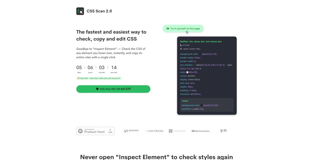
Although it’s designed to target and develop CSS for a website, it’s great to help find perfectly-sized images.
Step 2 – Find the image you want to get the size for
You can use CSS Scan to resize existing images, but we’re going to add a new image from scratch for this example.
Although we’re using Elementor, you can use CSS Scan for whatever builder you’re using or any website you’re working on (even if it’s not a WordPress Website.)
So we’ve loaded up a section with two rows. We’ve inserted an image into each row.
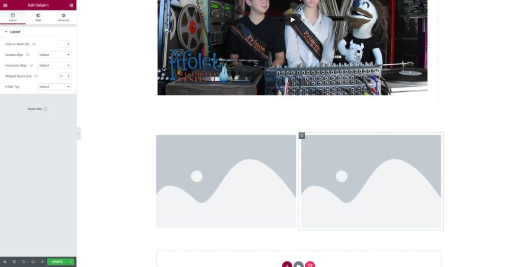
Next, simply enable the CSS Scan browser extension and then hover over the image that you’re trying to find the perfect size for.
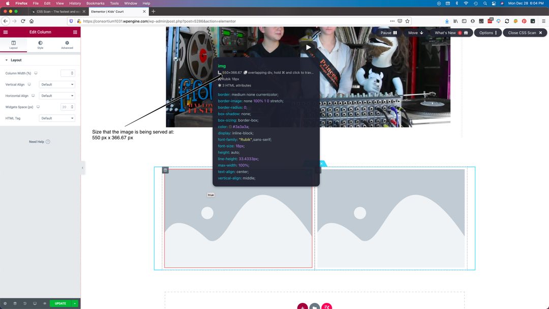
Step 3 – Crop your image to the proper size.
Now, all you need to do is crop your image to the size that is being served.
Note: We are using a 27-inch Mac Monitor, and the images are served at different sizes, depending on the device it is being viewed on.
The good news is that these dimensions are a “worst-case” scenario, and we know the majority of devices will serve a smaller-sized image, so we’re safe to use this size.
If you’re designing your website on a smaller device and think that your user may be on a larger device, you can either increase the size a little or just go with the dimensions you get from CSS Scan. The difference should be negligible and have little to no noticeable difference.
If you intend on your image opening up in a lightbox, you may want to view the webpage you’re working on on the frontend, click the image, and use the same process to find the size it’s being served at when clicked.
Then, just use that size.
Historically, we’ve used Photoshop to resize our images for websites we design; we’ve found it to be a little overpowered and uses too much RAM.
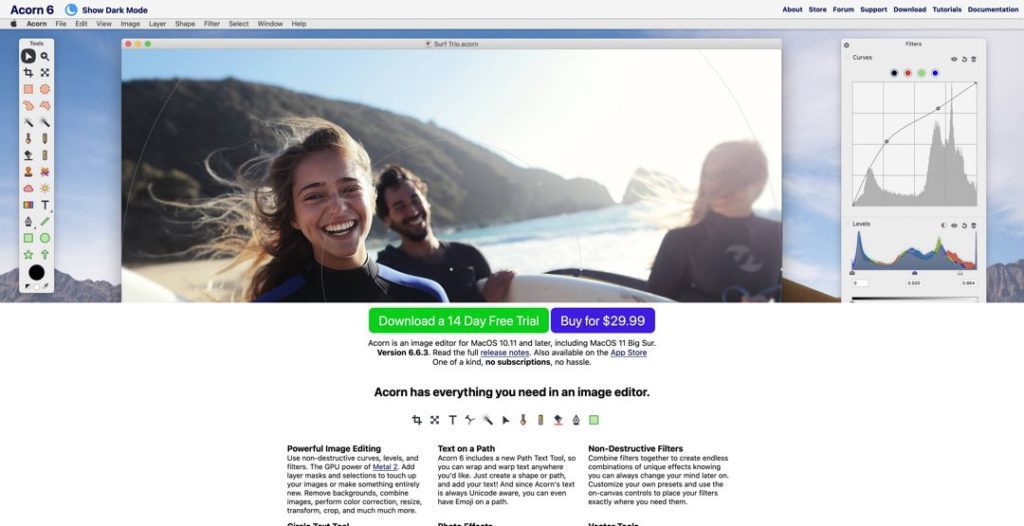
We’ve recently started using Acorn to do our minor image resizing and editing. Acorn has a smaller footprint and uses substantially fewer resources.
Step 4 – Upload your image, and voila.
Finally, all you have left to do is to upload your properly-sized image to your website.
That’s it.
You now have the perfectly-sized image on your WordPress (or other CMS) website.
Conclusion
So you see, there’s no need to look at thousands of tutorials on the perfect WordPress image size. You don’t have to have cheat sheets to remind you what size goes where.
Just use CSS Scan to find the perfect image size.
Let me know if you have any comments or how you use this workflow for your website design. I’m curious to know how it works for you.
Clint L. Sanchez
clint@blaksheepcreative.com
Looking for a real conversation about your business — no sales pitch, no commitment? Book a free 15-minute Discovery Call.