Instagram carousel posts are one of the most engaging post types already, but you can give them a further boost with these seven easy tips.
One of the most significant Instagram updates of the year was it becoming official that it’s no longer just a photo-sharing app.
Now, you can do so much more on Instagram with video, shopping experiences, and more. That doesn’t mean Instagram isn’t for images anymore. But it does mean that when you share them, you need to make it count.
All of these changes mean that you need to seriously consider making carousels a big part of your marketing strategy.
Why? Studies have shown that they have the highest engagement rates. According to Hootsuite, on average, their carousel posts get 1.4x more reach and 3.1x more engagement than an ordinary single post on Instagram.
So with that in mind, here are a few ways to make your carousel posts on Instagram even more engaging and top-performing.
What Are Instagram Carousel Posts?
If you’re not familiar, those are the “album-style” posts in your feed that can include up to 10 images or photos at a time.
The first time someone sees the post in their feed, it will show the first photo as the post cover. But unlike regular image posts in the feed, it has the opportunity to show up again if they don’t engage with it, this time showing another image.
Whether you’re marketing an eCommerce brand with photo dump style carousels featuring user-generated content of your products or an educational brand creating helpful infographics to teach your audience, carousels are a great way to frame content and make them digestible and engaging.
If you’re a business owner and want to get more engagement from your Instagram Carousel Posts, then you’ll need to follow these easy steps.
1. Keep in mind the fundamentals of good copy and content creation.
To begin, keep in mind that an Instagram carousel is simply another type of compelling copy.
If it helps, you can brainstorm and ideate the post as an article first, then format it to fit a carousel once you have a draft thought out.
One of the most effective techniques: know your audience and talk directly to them as individuals.
Even though you’re on a public platform where hundreds or thousands will read your post, you want each reader to feel like they’re in a personal conversation with them.
An easy way to do this is to ask questions or make it feel like you’re talking directly to them.
For example, you could write, “Have You Tried THIS Yet?
“Or, “How Has THIS Helped Your Business?”
Another effective technique for a carousel post is to use directional language.
Like in a good sales page or landing page, you should be using words that point towards an action.
If you want someone to click a link or visit your website, you should use language that makes it feel like an imperative.
Some great words are “click”, “visit”, “start”, “discover” and more.
The idea is to make your carousel post feel like a free but highly valuable resource.
You’ll also want to make sure you start with the most compelling content or image for the reader and consider “what’s in it for them” throughout the carousel.
2. Use the first picture as a “scroll topper.”
The first image in the carousel is essentially the hook.
Treat it as such.
It has one job: to catch the attention of those scrolling past your post. The first picture draws the user in, and the rest of the carousel takes care of the post’s goals and objectives.
Use your first image as an opportunity to “tease” what they can expect from the rest of the carousel and encourage them to swipe left to learn more..
Here are some suggestions to make use of that prime real estate:
- A quote with a large font size – The hook of the story or post, written in text. Similar to what you’d see on Twitter sometimes.
- An eye-catching design element – This could be an abstract illustration or piece of photography that ties into the following images but stands out on its own.
- A strong photo or video – This one probably goes without saying. If you only have room for one image in the carousel, it should be an eye-catching photo or video.
If you’re creating an infographic, the first slide should be a brief and powerful statement that draws readers into the rest of the information.
You have ten whole images to get your complete message across. Let the first image do its job and keep it simple.
3. Encourage People To Swipe Through
Now that you’ve got their attention with your first slide, you have to keep them interested until the end of your carousel.
You have to keep them scrolling!
As with any other marketing activity, the easiest way to get someone to take action is to ask them.
With the carousel, it’s not much different. You need to ask your reader or customer to swipe through each image to get your point across more fully.
A simple line in your caption with a call-to-action to swipe should do it. For example, influencers often put something like “➡️ Swipe through to see more!”
When you put this one simple sentence, you make it clear that the post is not over and there’s more to see. Your reader feels like the journey is not yet complete and wants to keep going!
Plus, it adds a bit of suspense and intrigue to the story. Who doesn’t love a good cliffhanger?
Another thing successful influencers and brands do in their Instagram Carousels is add a visual signal that there’s more to come.
This could be anything from a double arrow pointing to the next slide or repeating the same design element in each slide so you know they are connected.
4. Make Sure Every Slide Can Stand on its own
This is a slightly more advanced tip, but it’s something we’ve learned from experience. If you want to create engaging carousel posts, make sure each slide can provide value on its own.
Your post will feel much more cohesive if the slides are all valuable “mini-articles” rather than one long piece of content.
Have you ever come across a blog post that’s just one long paragraph? That can be pretty hard to read – so why would you do the same thing with your carousel posts?
The goal with every slide is to make it valuable enough that users will check out the entire post.
If you can do this, your carousel content will be more likely to get liked and shared – which is vital for driving traffic and growing your following.
Plus, you never know which image will be the one someone lands on, as people can share specific ones in their Instagram stories and messages.
It’s more likely that they will share a slide that stands out on its own.
Plus, after a user has seen the first image, the post may reappear in their feed. But this time, it may display one of the others.
Remember, all images are a potential entry point, so it’s essential that each one is engaging and valuable.
After all, you never know which image will be the first one someone sees and decides to check out.
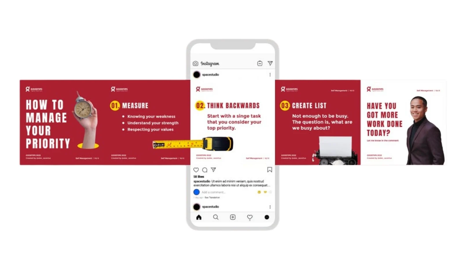
5. Keep Things Cohesive
A common mistake that people make when trying to make each image into something that can stand on its own two feet is that they make each image very different from one another. If you want to create cohesive content, on the other hand, it’s better if all of your images stick to a central theme.
The worst thing that you can do is end up with ten separate graphics without any way to tie them all together.
You want the photos to appear as if they’re part of a bigger idea.
Some ways you can keep things cohesive
- Make it easier for customers to find and understand your brand by utilizing the same typefaces and colors across all graphics (brand standards should make this simple).
- Use the same filters, styles, and angles for each image.
- Make sure that you include similar or related objects in each image
- Feature-related or similar products or services in each graphic.
- Make sure that the captions all have a similar tone of voice.
- Embed a series title or watermark in the corner of all images for easy identification.
Be careful not to go overboard with cohesion, though. You want your images to be able to stand on their own two feet rather than coming across as too homogeneous and repetitive.
Here’s an excellent example of how one brand tied all of their image together.

At the same time, you want people to understand that the images are related to one another.
In general, stick with a central theme and be consistent.
It’s OK if each image has its own unique feel, but you want all of the photos in a given Instagram Carousel post to match one another.
The more cohesive your Instagram carousel posts are, the better they’ll perform throughout Instagram and across other channels as well.
These techniques will help you have a cohesive brand, playing a significant role in building brand recognition.
Once you have a solid grasp of creating cohesive content, you can work on ensuring that all of your posts blend together.
6. Avoid Information Overload
Your Instagram carousel post should have only one focus. Add too much information, and you will turn off your audience. They want to see just enough information to understand the point of the photo or video without having too much clutter.
Another way to think of it is this:
You have much more space to get across the same amount of information in a carousel post, so don’t use it all up with everything you know about the product or service. You can always do another post later with the rest of the details.
Let your content breathe.
For photo carousels, try to keep the images minimalistic, easy, and zoomed-in. Allow people to focus on the specifics of the photograph.
Don’t try to cram several sentences onto a single slide for infographics. Make sure the text has enough padding around it so that they can read it easily without users having to hold the phone up to their face.
7. Remember that accessibility is important.
More images in your Instagram posts means more that you have to make accessible to vision-impaired users.
We’ve repeated time and time that your website should be accessible for everyone, but the same rule applies to your social media.
Why?
If you neglect disabled users, you cut out a massive slice of your potential audience.
The way to accommodate this is to include alt text on every image you post – especially if it’s an infographic or another type of visual media.
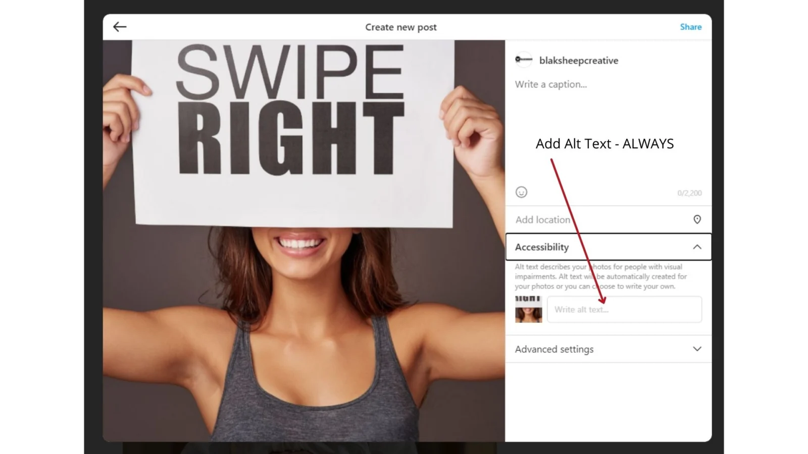
It’s also helpful to add image descriptions in the captions or first comment for users using a device that doesn’t show them the alt-text.
Keep your Visitors Scrolling!
Now you know the keys to creating engaging Instagram carousel posts.
If your business is struggling with social media engagement, it may be time for a new strategy or more creative thinking on how to leverage these principles in your marketing efforts.
Looking to make social media actually drive leads, not just impressions? Book a Discovery Call and we’ll talk through what’s worth doing for your specific business.